Quantifying Cycling Trips in the City of Sydney
Note
This analysis was delivered commercially by UrbanSpectra Pty Ltd for the City of Sydney: cityofsydney.nsw.gov.au/research-reports/daily-cycling-trips-city-of-sydney.
It has been republished here. This page is available as a PDF at urbanspectra.com/pdf-report/quantifying_cycling_trips_in_the_city_of_sydney-urbanspectra.pdf. To cite, see Section 8.1.1 Attribution.Code and data is published openly. Link to or access individual files under files.urbanspectra.com/2026/quantifying-cycling-trips-in-the-city-of-sydney/files/ (example).
The author is UrbanSpectra Pty Ltd, the City is the original publisher. See Section 8.1 Licences.
Executive summary
Due to the inherent freedom of movement, cycling activity is difficult to measure directly[1, p. 23] (PDF p. 34). This report estimates daily cycling activity in the City of Sydney (the City) Local Government Area (LGA), as well as detailing exploratory analysis of cycling patterns, cycling activity and safe cycling infrastructure.
While it is simple to count bicycles at specific locations and times, no level of detail will derive an accurate observation of the whole network: some trips pass multiple counters, others are not recorded at all. The total number of trips cannot be observed, so must be estimated as a function of available data.
This work was commissioned by the City of Sydney in response to the need for a clear and defensible figure that can support public communication and decision making.
The source code implementing this estimation algorithm is published under an open source licence (see Section 8.1), and this report is CC-BY-4.0. Limitations to this methodology are candidly described (Section 5.2).
Methodology
This analysis uses a deterministic approach to estimate total cycling activity, implementing a similar methodology to that currently utilised by Transport for London[2].
Briefly, the method estimates cycling trips in two steps. It first estimates the total distance travelled by cyclists across the network (cycle-kilometres), and then divides this by an average trip length, to estimate the number of trips.
To estimate cycle-kilometres, the analysis uses flow counts from locations across a wide diversity of geographic locations and infrastructure types, and the (known) street network length of such infrastructure. This approximates cyclist flows on streets stratified by similar infrastructure type and geographic location. This approach prevents double counting, as it focuses on the total distance travelled rather than individual trips. Trips that only partially take place in the study area are captured pro-rata.
A set of ‘partitions’ is defined to group count locations by geography and infrastructure type, to approximate activity on all such similar streets. For this analysis, the network is partitioned by geography (CBD, inner suburbs, and the remainder of the LGA) and by infrastructure type (cycleways, shared paths, state roads, and other roads).
The analysis uses an average trip length of 5.5km to approximate the number of trips from the cycle-kilometres. Available data sources estimate average cycling trip lengths in the City of Sydney to range from approximately 4.7km to 5.6km (Section 5.1.3.8). This analysis adopts the upper end of this range, consistent with TfNSW Household Travel Survey findings (Section 5.4.1.1). A longer average trip length was chosen as it produces a more conservative estimate of total trips.
While formal, comprehensive guidance on active transport modelling is limited[3, p. 24], Austroads publications state such a stratifying technique is suitable for estimating vehicle kilometres travelled (VKT)[1, p. 121] (PDF 132). This methodology has been utilised in other cities (Section 2.2) and the underlying method is well established[4, pp. 88–89] (PDF 103, 104) [4, p. 157] (PDF 171).
A simplified case is illustrated below:
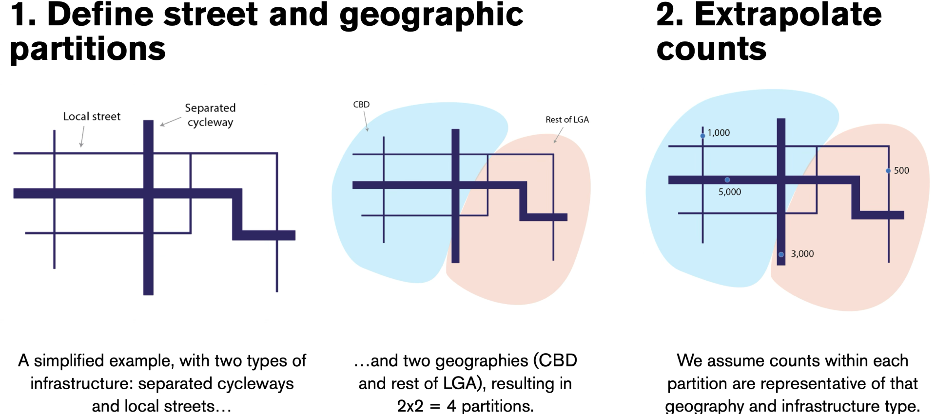
3. Calculating the network lengths for such an imaginary network:
| Infrastructure type | Geography | Network length (centrelines) | Avg daily bike flow | Cycle-km |
|---|---|---|---|---|
| Roads | Inner city | 12 km | 2,000 | 24,000 |
| Cycleways | Inner city | 2 km | 5,000 | 10,000 |
| Roads | Outer city | 20 km | 500 | 10,000 |
| Cycleway | Outer city | 10 km | 3,000 | 30,000 |
| Total | 74,000 |
4. The total number of trips can then be approximated
\[ \frac{74{,}000 \text{ cycle-km}}{5.5 \text{ km/trip}} \approx 13{,}450 \text{ trips} \]
Data
The City has significant sources of automatic counter and manual count data.
This analysis includes detailed processing of manual count data. Detailed turn movement data is recorded manually half-yearly at a wide variety of sites, so street flows can be defined as sums of turn movement flows. These sets are defined as ‘virtual screenline’ counts (see Section 4.1.1.2.2).
This work utilises multiple datasets including:
- Automatic counter data from City of Sydney counters (Section 4.1.1.1.1) and half-yearly manual counts (Section 4.1.1.2) (expanded through ‘virtual screenline’ counts1 - Section 4.1.1.2.2) to indicate typical bicycle volumes over a geographically diverse range of infrastructure types (Section 5.1.3.5)
- OpenStreetMap data for the underlying street network lengths (Section 5.1.3.6)
- Household Travel Survey data provided by TfNSW (Section 5.1.3.8) and See.Sense data (Section 5.1.3.8.1) for average trip lengths
- Household Travel Survey data provided by TfNSW, share bike trip numbers from Ride Report, rider demographic surveys and Census data to sense check the overall estimate (Section 5.4)
Findings
The analysis included exploratory analysis of cycling patterns, and estimation of daily cycling trips in the City of Sydney LGA. Due to time constraints, limited analysis on potential network effects was undertaken.
Exploratory analysis
The exploratory analysis findings (Section 4.2) include that derived ‘virtual screenline’ counts during peak hours were comparable between manual and automatic counts on the same day (Section 4.2.3). This increased confidence in the usability of this data for estimating flows.
The highest peak flows as a percentage of daily flows were at an approach to the Pyrmont Bridge and on the College Street cycleway, representing busy commuter routes. The lowest peak to daily volume included Mary Ann St (Ultimo), the Zetland and Green Square counters (Section 4.2.2).
Using the ‘new’ automatic counters, Tuesday and Wednesday were found to be the busiest days of the week. Monday and Friday were slightly less busy, and very close to the weekly average. Saturday and Sunday had the lowest flows, with a wider range (Section 4.2.4).
Some effect of rainfall on cycling volumes was found (Section 4.2.6), however this analysis is limited by the lack of a full year of reliable data from the ‘new’ City of Sydney automatic counters, and 24-hours-to-9am rainfall data making comparison with other weather variables challenging. More substantial analysis is recommended after more data is collected. This would be especially relevant to any future analysis of delivery rider patterns. The day of the week appears to be a more substantial influence on cycling volumes compared to the weather. This will also require further evaluation and study when more automatic counter data is available. There was no outstanding pattern between the October/March manual counts (Section 4.2.5).
Trip estimation
This analysis estimates approximately 48,000 daily cycling trips (or pro-rated trips) occurred in the City of Sydney council area on a fair-weather weekday in March 2026 (covering approximately 264,000 daily cycle kilometres).2 (Section 5.3).
This estimate can be viewed in the context of other estimates or lower/upper bounds:
- 20,080 average weekday bike share trips in 2026-03 (Section 5.4.2)
- TfNSW HTS estimates of 23,000 journeys within the City + 29,000 to/from the City (across a 2022-06 -> 2025-06 sample) (Section 5.4.1)
- >28,000 2023-01-16 trips in an extract from prior research[5] by Saberi & Lilasathapornkit (2024)[6] (which the author expects to be an underestimate) (Section 5.4.3).
The TfNSW HTS and Saberi & Lilasathapornkit (2024) estimates were received after initial implementation and outputs were generated.
These are plotted on the same axis below (noting the limitations in past estimates in the caption):
It must be highlighted the 26 ‘new’ permanent (automatic) counters were installed in late 2025 (few new automatic counters contributed to the October 2025 estimate). Past estimates of cycling activity are limited by lower-quality (or more sparse) data, and definitional or measurement methodology changes in manual (observed) count recordings, so should be understood as being more uncertain than recent estimates.3
There is not yet a full year of continuous automatic count data from the 26 new permanent counters on the cycling network: future estimates will be able to utilise an unbroken series of high-quality count data. Taking this into account, the estimations using the remaining manual (or older automatic) count data suggest a significant growth in cycling activity - an estimated (approximate) 39,000 trips in March 2025, and approximately 26,000 trips in October 2021.
It is clear that share bike trips are contributing a large increase in cycling trips since late 2024 (Section 5.4.2). This is perhaps the clearest continuous and reliable indicator of cycling activity since 2024, until there is more automatic counter data (from the ‘new’ counters) available.
Any interpretation of this chart of past counts should understand the limitations in this data - for example the 2018/2019 ‘bump’ could be an artefact of manual survey methodology changes (Section 4.2.1.2).
Validation
The analysis compared outputs to independent estimates to sense check the methodology:
- TfNSW Household Travel Survey data from FY 2024/2025 estimates 23,000 trips per day entirely within the LGA and 29,000 to or from the LGA, or up to an estimated 52,000 daily trips (Section 5.4.1.2, Section 5.4.1.3).
- Saberi and Lilasathapornkit (2024)[6] estimated just over 28,000 bicycle trips per day (for 2023-01-16) in the LGA using a machine-learning approach, compared to roughly 31,000 estimated here for March 2023.
- In March 2026, there were approximately 20,000 weekday-average share bike trips (Section 5.4.2, Figure 2).
The results are broadly consistent with these benchmarks, which supports the overall estimate.
Given the significantly different distribution of share bike trip lengths (Section 5.4.2.1) this should not be expanded by over 6x (as a ‘bicycle share’ of 16% might suggest). Nevertheless, that the number of weekday-average share-bike trips is approaching the entirely-within LGA HTS estimate and 2023 all trips estimate indicates a serious increase in cycling activity.
Conclusion
This analysis has resulted in the generation of a defensible estimate of cycling activity, and in the process - collated, derived, evaluated, and published detailed cycling data. This will provide a valuable dataset for analysis in years to come, and may spur further academic analysis and insights.
The headline estimate of 48,000 trips is subject to a number of assumptions and limitations, described within this document in detail. This number is not possible to determine perfectly: this should not be stated or claimed as an exact estimate, and conversely, slight variations do not invalidate this. This is a ‘best-guess’ estimate.
Varying average trip lengths have a significant impact on the estimate. For example, assuming a trip length of 4.7km (Section 5.1.3.8, Section 5.1.3.8.2 [7, p. 28]) yields ~56,000 trips, or an average trip length assumption of 7.8km (the highest HTS estimate: Section 5.4.1) yields ~34,000 trips. Average trip lengths across Sydney may vary with pricing policies of commercial share bike operators, or increased e-bike usage due to lower costs or “transformative”[8, p. 3] support programs.
A statistically-significant confidence interval range has not been specified, given this estimate relies heavily on the representativeness of the source data, and the average trip length4.
Evaluation and interpretation of this analysis should appreciate its constraints. While the author has made every effort to ensure accurate citations and outputs, this analysis has not withstood the rigour of academic peer review.
The author - who cares deeply about the subject matter at hand - hopes these insights and public contributions will be much appreciated by the client and wider public into the future.
1 Introduction
How many cycling trips are there in the City of Sydney? Such a question is valid, but is not straightforward to answer, and requires assumptions, approximations and inferences. What counts as a trip? How long is a trip? What about commuter trips into or out of the City of Sydney council area? Pedestrian and bicycle volumes vary by time of day and day of the week and are also subject to seasonal variations[1].
This report details the outputs of such estimates, an overview of the methodology development and any necessary assumptions, and visualisation and analysis of cycling data within the City.
While this is a deterministic ‘First principles estimation method’[3, p. 223], it only estimates current trips. Modelling or forecasting future demand (or route assignment) is not in scope.
The author has endeavoured to use clear language to support accessibility to a wide range of interested readers who may not necessarily have a technical background. Technical readers will take interest in the openly released source code.
1.1 Background
In April 2026, the City of Sydney (the City) provided UrbanSpectra Pty Ltd a brief to develop a credible, high-level estimate of daily cycling activity within its local government area (LGA). The City desired a methodology that prioritised clarity, transparency and explainability. UrbanSpectra responded with a proposal drawing on the author’s literature review, software development experience, and subject matter interest.
2 Literature review
This section provides an overview of existing methods to estimate cycling trips within a given geographic area through deterministic methods.
There is no adopted methodology for this in Australia, either produced by Austroads[1]5 or TfNSW[3], so the author looked to international examples.
Ultimately, the Transport for London (TfL) method was chosen as the basis for this analysis. This approach was selected because:
- It is statistically sound
- It is clear, auditable, and easy to understand and replicate - it can be explained in a few paragraphs or on a whiteboard
- It does not use ‘black box’ algorithms or models, and does not use ‘AI’ (or large unlabelled weight regression models)
- It is relatively simple and can be easily updated with new data
- The method was feasible with existing data available to the City of Sydney
- It is a well-established method utilised by a leading transport agency
This methodology is described in detail under Section 5.1.
2.1 TfL Cycling Use Estimates Method
The TfL Cycling Use Estimates Method is used to calculate TfL’s annual cycling use estimates[2, p. 2], as published in the Travel in London reports[9].
The methodology is clearly described in a 19 page document[2], last modified or edited 2024-05-17[10].
This methodology also powers TfL’s Cycle Counts Dashboard[11] (which has its own user guide[12]).
The current TfL cycling use estimates methodology was developed in 2022 and replaced two previously unrelated methods to estimate cycling volume (cycle-km) and cycling journeys. After a review these previous methods were found to present limitations[2, p. 3]. It is the current and latest TfL methodology, and there is no intention to change it.
The first cycling use estimates obtained with the new methodology were presented in Travel in London report 15[13]. The methodology was more formally established as the agreed approach to monitor cycling trends in the Cycling Action Plan 2[14]. The method used to estimate cycle trips changed in 2015[15].
2.1.1 Choice of sampling groups
TfL uses 15 sampling groups. Groups are created geographically (central, inner and outer London) and by road type. In urban UK, roads are classified as A roads, B roads, minor roads or local streets (excluding motorways). TfL uses this classification as a ‘proxy’ for the importance of the road, which they hypothesise is correlated with the cycle flow (ie. they assume more cyclists on busy corridors)[2]. ‘motor vehicle-free’ was added as a stratification. This is not a category in the UK classification of roads because these are not strictly ‘roads’ as general traffic cannot use them. These five road types times the three areas gave rise to the 15 sampling groups[2].
The groups were chosen in the TfL case as a compromise between trying to stratify using variables that could have an impact on the dependent variable (cycle flow) but constrained by easily available data (area and road type attributes).
2.2 Washington (state) estimation
Estimates of bicycling miles travelled in Washington State, authored by Krista Nordback, Mike Sellinger and Taylor Phillips, also define a similar methodology mathematically [16, p. 23] (PDF p. 29). It was also described in a 2014 report[17, p. 36], PDF p. 47.
It is described in a similar manner to the TfL method[2] as it:
- sums the distance of the network in each group
- averages the average flow of all sensors in each group
- multiplies the average flow by the distance of the network in each group
- sums the results for all groups
The 2017 report expresses annual Bicycle Miles Travelled (BMT) as: [16, p. 23] (PDF p. 29) (formula 3-11) (also in the 2014 report [17, p. 36] (PDF 47))
\[ BMT = 365 \times \sum_{p=1}^{24} \left( \frac{L_p}{m_p} \sum_{q=1}^{m_p} AADB_{pq} \right) \]
Where:
- \(BMT\) = Bicycle miles traveled in the state
- \(AADB\) = Estimated annual average daily bicyclists at a given count site q in group p
- \(Lp\) = the total centerline miles for each group p
- \(m_p\) = the number of count sites in group p
- \(p\) = a counting variable indicating one of the 24 groups into which the roads, paths and count sites of the state have been divided by region, ‘urbanity’ and facility type
- \(q\) = a counting variable indicating one of the counting sites in group p
This report noted methods were also developed to estimate average day volumes based on two-hour manual counts [16, pp. 19, 25].
3 Data sources
High-quality data on cycling activity, typically flow counts of cyclists passing a given position, have been scarce compared to other modes of transport[18].
Potential sources of cycling related data were searched through the Data NSW site, through online resources such as the National Cycling Data Exchange, academic literature, the Bicycle NSW overview of available data[19], and by querying City staff.
3.1 Data used in analysis
The primary data sources for calculating cyclist counts/flows were the City of Sydney automated bicycle count data (described in detail under Section 4.1.1.1.1) and City of Sydney bicycle count surveys (see Section 4.1.1.2). TfNSW automatic counters were also integrated (see Section 4.1.1.1.2).
The primary data sources for determining the average trip length were TfNSW Household Travel Survey (HTS) data (see Section 5.4.1) and See.Sense data (under Section 5.1.3.8).
OpenStreetMap geospatial data was used as the underlying street network geometry (see Section 5.1.3.6).
Transport for NSW data on state roads (Section 5.1.3.6.1) was utilised to identify roads that have high volumes of vehicle traffic, in the absence of open vehicle volume data.
Licences for utilised data are included under Section 8.1.
3.2 Data not used in analysis
3.2.1 TfNSW Bike Share data
This TfNSW dataset contains monthly patronage data for the Bykko bike share service. Only data for CONTRACT_CODE Bykko - Newcastle is provided publicly on the TfNSW CSV[20]. TfNSW does not appear to publish any share bike data in Sydney.
3.2.2 Strava Metro dataset
The Strava Metro dataset includes information derived from users with the Strava app (or a fitness tracking device) running during a bike ride, typically for recreational sport purposes.
The Strava Metro platform (Metroview) shows relative cycling activity[21].
Data from the Strava Metro trial dataset[22] does not include average trip lengths or times.
Strava uses a statistical model that takes Strava bicycling estimates along with actual/official cycling counts, different network, population, and land use characteristics to provide corrected estimates of bicycling counts[21]. This model and source data is not publicly released (or releasable), so other data sources were used for this analysis.
3.2.3 Bicycle Network Super Tuesday counts
Bicycle Network organises some manual counts around Australia, and publishes data after a 12 month lag. The publicly available SUPER SUNDAY RECREATIONAL COUNT DATA (2010-2025) includes one location in the City (Abercrombie St towards Shepherd St [E], Codrington St [S], Abercrombie St [W], Codrington St [N], for 2018-11-11). ‘SUPER TUESDAY COMMUTER COUNT DATA’ (2010-2025) includes 11 rows of data, including a couple of locations over 2015-2017.
Given the City’s comprehensive manual count programme, this data was not used for this analysis.
4 Exploratory Analysis - Cycling Patterns
To look at patterns in cycling data, a large number of data sources were consulted and combined.
Much of this project involved methods of processing the half-yearly manual count data.
4.1 Methodology
The nature of pedestrian and bicycle movements is not as restricted to specific roadways as that of vehicles, hence the greater difficulty in collecting and describing information[1, p. 23] (PDF p. 34). Pedestrian and bicycle volumes vary by time of day and day of the week and are also subject to seasonal variations[1].
4.1.1 Selecting and deriving cycling counts
A number of data sources were used:
- A network of permanent (automatic) City of Sydney-funded bicycle counters, which report flows in 15 minute chunks - covering the separated cycleway network comprehensively
- A half-yearly City-wide manual traffic count - covering the council area with a diverse set of locations
- A small number of Transport for NSW counters
- Historical City of Sydney counter data
The March 2026 (headline) estimate primarily utilises the new City of Sydney counters and March 2026 manual count. Other data sources primarily contribute to past estimates.
Count site totals (March 2026):
For cycleway infrastructure only, the split of automatic versus manual count flows:
The map below shows the location of every count type used in this analysis: the current City of Sydney permanent (automatic) counters, the half-yearly City of Sydney manual count surveys (as their derived virtual screenlines), the Transport for NSW counters, and the removed (historical) City of Sydney counters. Dots are coloured by counter type.
Toggle each series on or off for the following chart:
4.1.1.1 Permanent counters
Note: Skip to Section 4.2.1 to see charts.
There are a number of automatic counters - or permanent, continuous bicycle counters - installed in the City of Sydney area. The automatic bicycle counters cover the separated cycleway network well (and some shared paths) however do not capture on-road flows.
The map below shows every permanent (automatic) counter location across the three sources - the current City of Sydney counters, the Transport for NSW counters, and historical City of Sydney counters.
Each location is coloured by the date of its most recent reading. The current City of Sydney counters read up to the present, some TfNSW counters stopped some time ago.
4.1.1.1.1 City of Sydney automatic counters
Most automatic counters are operated by the City of Sydney council. The City of Sydney installed 26 new automatic counters in late 2025. These replaced previous counters which had ongoing reliability issues, making utilisation for insights challenging.
The author was provided with a login to the City of Sydney Metrocount Atlyst dashboard, which provides comprehensive data export capabilities. The author downloaded 15-minute count data (the highest resolution) for all City of Sydney operated counters for their full operating date range6. These form the primary automatic data input into the estimates.
When the author requested documentation from the city regarding validation of counter accuracy, the City provided documents received from MetroCount to document the accuracy of such counters. Such results included:
- “MetroCount has met and in some instances exceeded the high and stringent tolerance of 95% detection and operational availability performance targets set in the contract. The current availability of the network of 36 Bike stations has been maintained at 100%.”[23]
- MetroCount results were more agreeable with reality than two other brands tested[24].
- “The Metrocount unit provides a highly accurate cyclist count (99% or greater)”[25]
Given these results, no correction factors were applied for MetroCount counters.
These new MetroCount counters use piezoelectric strips which can be buried beneath the road surface, instead of test tubes which are laid above the road surface. This requires less maintenance[24].
As the desired output is for a typical fair-weather weekday cycling trip estimate, and manual counts are conducted on a fair-weather weekday, automatic counter data must also be for weekdays. As the day of the week is more often than not a Tuesday (but is commonly a Wednesday or Thursday) March/October of the count changes - occasionally with differing sample days included within each half-yearly survey - the March or October average of weekday volumes of automatic daily counter is utilised.
To illustrate, the flows of all automatic counters on 2026-03-17 are shown below:
Of the 26 ‘new’ counters:
- 7 were entirely new (College, Oxford (West) with display, Pitt, Henderson, Gadigal, O’Dea)
- 13 were kept (Castlereagh, Liverpool, Town Hall (Kent), Kent North, King West, Miller Street, Glebe Foreshore, Bourke St Surry Hills, Bourke St Redfern, South Dowling footbridge, Epsom, George St Waterloo, Bourke Road Alexandria)
- 5 were moved (Union Street to Pyrmont Bridge Road, Central Park (Balfour St) to Mary Ann Street, Prince Alfred Park to George Street, Buckland path to through-site link, Wilson to other side of Golden Grove)
- 2 were deleted (St Johns Road (nearby TfNSW counter), Buckland St mixed traffic (covered by through-site link))
Note: Skip to Section 4.2.1 to see further charts of count data.
4.1.1.1.2 TfNSW Bicycle Counters
Transport for NSW also operates some automatic bicycle counters, with data published on Walking and cycling counts[26]. This dashboard co-mingles City of Sydney counters, TfNSW permanent counters, and some computer-vision-derived counts[27]. Names, types or operators of counters are not labelled; no documentation regarding TfNSW counters is publicly available, and no counter coordinates are included. While the site states “…TfNSW will retain copyright over the above material and information provided.” a licence was granted to the City to publish it under CC-BY-4.0[28] - see Section 8.1.
As location coordinates are not available, locations were manually approximated by selecting relevant locations on OpenStreetMap7. For this use case the exact coordinates are not critical for calculations, only that they fall in the correct region.
Given there does not appear to be a public list of TfNSW-operated counters within the City, the author referred to City of Sydney documentation to select data from these sites on the dashboard [29]:
- Sydney Harbour Bridge
- Anzac Bridge
- Bridge Rd Glebe
- Moore Park Road
- Fitzroy Street
- Sydney Park Road
As of 2026-04-17, the Pyrmont Bridge Road counter was not working and being reinstalled[27].
These files were downloaded from the above project page by:
- Setting
Day typedropdown toWeekday (excl. PH) - Setting duration to
Last 5 years(the max available) - Selecting a counter
- Downloading using the ‘meatballs’ in the
Average counts (per site per day) by monthchart- to a CSV using
Summarized data- you need to scroll ‘below the fold’
- to a CSV using
Other artefacts: - An Epsom Road counter was also found with data prior to the CoS counter at that location. The later data (after the large gap) was removed. - A Cleveland St counter (Prince Alfred Pk - North of George St) was also found, with data from 2021-2023. It appears to be a duplicate of the old CoS counter 4G Prince Alfred Park.
Months with an empty value or 0 are excluded during data import. Otherwise, even if the full number of days is less than complete for a month - as values were the weekday average - they are preserved.
Coordinates for these are approximate and added through manual approximation, as TfNSW does not publish this data.
TfNSW Open Data hub also includes a cycling count data collection[30], including:
- Historic RMS Cycling Statistics from 2007 to 2019, which includes 26 counters in total and 3 counters in the City of Sydney. No definition of the
y_YYYY_MMMcolumns is given. The three counters are:- The “Sydney Harbour Bridge bicycle path”, counter
- The “Anzac Bridge cycleway, near Quarry Master Drive, Pyrmont (Cyc)” counter, which was inoperable from Feb 2015 to Oct 2015.
- The “Anzac Parade cycleway, near Lang Road, Moore Park”, which was inoperable December 2013 to June 2015.
- Historic Cycleway Usage, with cycleway usage and pedestrian counts from 1 Jan 2018 to 11 Sept 2020. Daily counts are supplied. There are 3 relevant counters in the City:
- “90902 - Sydney Harbour Bridge bicycle path, near Upper Fort Street, The Rocks (Cyc)”
- “90903 - Anzac Bridge cycleway, near Quarry Master Drive, Pyrmont (Cyc)”
- “90907 - Anzac Parade cycleway, near Lang Road, Moore Park”
- A link to the City of Sydney manual bicycle surveys dashboard[32]
- A link to the City of Sydney automatic counter dashboard
4.1.1.2 Bicycle Count Surveys
The City has commissioned half-yearly intersection bicycle counts for peak hours (6-9 am and 4-7 pm) on one day in March and October every year, since March 2010 (excluding March 2018). The latest available data is for 2026-03.
Total ‘bicycle spotted’ values for each intersection are published on the Bicycle Count Explorer8, however such values cannot be attributed to any given street and have limited usefulness.
However the source survey sheets include a vast amount of useful detail with per turn movement flows:
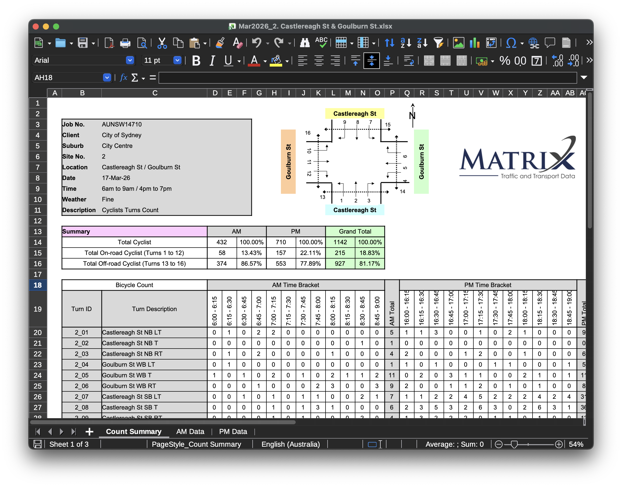
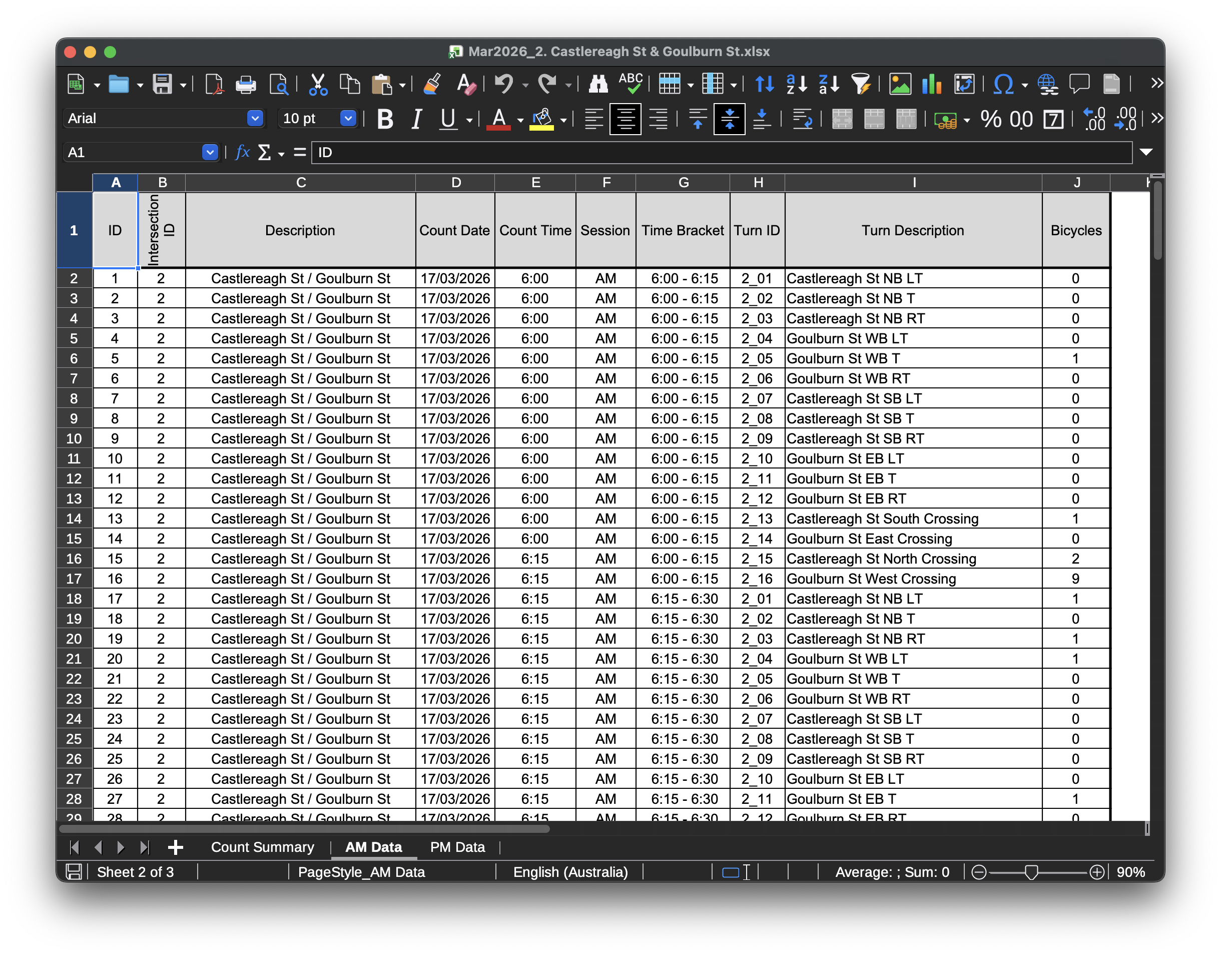
The chart below shows which count sites have valid data in which survey months. Each row is a count site (by manual_count_site.id) and each dot marks a survey month for which that site has at least one recorded count.
There are also a few individual files with data issues. See Section 8.3 for further detail on files with anomalies - which were skipped out of precaution.
Note that files with additional information sheets remain consistent, allowing use of these fields in…
4.1.1.2.1 Manual count sums
The chart below sums every recorded manual_count_sample.bicycles movement at each count site (intersection), for each survey month. Each faint line is one intersection (manual_count_site.id) over time. Note these are raw peak-hour movement sums - they are not expanded to daily figures and double-count flows that appear in more than one turn movement; they give an overview of relative survey activity per site rather than a link or screenline flow.
This shows that while some sites have consistently high (or low) counts, there can be a large variation in counts at each site over time.
Summing across every count site gives the total recorded movements per survey month below:
While there were a number of changes in 2018 to the sites recorded, the total sum remained similar.
4.1.1.2.2 Defining ‘virtual screenline’ counters
To estimate the flow of a street at a given location, the flow along that point is required - not a ‘bicycles spotted at an intersection’ metric, which gives no insight into the relative flows at various incoming/outgoing streets.
Given there is detailed turn movement data recorded at a wide variety of sites, flows can be defined as sums of turn movements. These sets are defined as ‘virtual screenline’ counts. Such sums define the flows at incoming/outgoing edges - or streets at intersections. These capture a large variety of on-road flows across many different road types across the LGA. See charts and visualisations of this data under Section 4.2.1.
As in some cases street names differ from those recorded in OpenStreetMap, and intersection geometry is presented as images, the source data sheets do not present a trivial method of locating such approaches. While future approaches could utilise geocoding approaches, given that outputs would need to be checked manually to ensure correctness anyway, the author mapped turn movements to each virtual screenline manually by viewing the spreadsheet, fetching a lat/lon on OpenStreetMap and using a script to update the JSON definition with this information.9 While all efforts have been made to verify these definitions (including reviews utilising the client’s local knowledge), given this is a manual process it is possible there are minor errors.
While more geographically representative, there are limitations in the granularity of the half-yearly manual count data:
- They cover AM/PM peak on one day (typically a Tuesday) in March and October
- There are limitations in the fidelity (or meaning) of how turn movements were recorded at more complex intersections
- Count sites were not chosen randomly (more discussion is under Section 5.2.1)
There are limitations in the correctness and consistency of these manual survey sheets. In some cases assumptions must be made on what a movement represents given limited context in the source sheet. See Section 8.3.1 to see any assumptions made, or any limitations.10
Some errors have been found in how movements were recorded. They were undertaken over many years and likely changing personnel. Virtual screenlines were defined to be most accurate for the currently present infrastructure. Past virtual screenline counts should be interpreted with caution. Some errors are detailed under Section 8.3.2, however there are likely other unidentified issues. To see variation in old virtual screenline counts, see Section 4.2.1.2.
As the required output is for an estimated weekday daily cycling trip estimate, expansion of ‘peak hours’ counts to a daily figure is required. Full-day data from automatic counters in similar geographic locations is used to derive peak-to-day expansion factors for every sample area.
Some ‘virtual screenlines’ define cycleway flows at an intersection by a footpath crossing figure. These are defined when the footpath flow is extremely large. Given these counts go back some time it must be ensured such measurements are not derived before a cycleway was built at such a crossing. Therefore, virtual screenlines may have a valid_from date, where before this date they should not be evaluated.
The virtual screenlines with a valid_from cutoff are listed below:
Note valid_from dates for virtual screenlines may be derived from the same source, but are a separate output to cycleway opening dates. See Section 6.3.1 for a map of cycleway opening dates.
4.1.1.2.3 Change in manual count site locations
After the 2017-10 survey, a number of manual count locations were changed. While the methodology aims to control for such changes if the geographic composition changed, comparisons across this boundary should bear this in mind.
4.1.1.2.4 Handling footpaths
Parallel footpath crossing movements (flows) are assigned to the ‘virtual screenline’ of their parallel road: they are not separated into a separate sample/segmented group of footpath estimates.
By assigning parallel footpath movements to the parallel street/road, there is no double counting.
This means the same road name on the opposite side of the intersection also includes these movements - however this isn’t double counting as flows are averaged rather than summed. In cases where there are more than 2 intersecting roads, only the adjacent footpath movements (those directly adjacent to the road of the ‘virtual screenline’) are assigned: footpath movements to ‘follow on’ crossings are not included as the user must traverse the first crossing to get there (this would result in additive double counting of footpath movements).
The source manual count spreadsheets include counts for footpaths using footpath crossings adjacent to the road. These are included in turn-mappings for evaluation, but tagged with type: 'footpath'.11
In some cases footpath counts are a significant ratio of the total on road count, even when no shared path or otherwise designated crossings are available. For example, at Cleveland and Regent in March 2026 around half of cyclist flows (excluding the eastern/western shared path movements) were observed on the footpath. It is not stated whether people were walking or cycling while crossing, or their age.
There is no double counting of two-stage bicycle crossings where bicycle users cross two footpaths to turn eg. a cyclist turning north, then left. In this case, it would be accurate to assign the cyclist flows to the flow of the road south of the intersection and to the road east of the intersection. These flows are averaged, not additive.
There is possible undercounting, rather than double counting, where cyclists only utilise one crossing to make a turn. In a case where a cyclist is travelling north and then turning east:
- If from the western footpath to the northern footpath, they are counted in both flows
- If from the western footpath to the southern footpath, they are only counted on the destination road
- If from the eastern footpath to the northern footpath, they are only counted on the origin road
- If from the eastern footpath to the southern footpath, they are not counted at all
This chart plots the relationship between ‘on-road’ (AM + PM) cyclist flow counts and type=footpath cyclist flow counts at parallel footpath crossings. One would expect these to be correlated - outliers are good intersections to evaluate the correctness of the turn mappings. Note that due to the measurement methodology, footpath movements are the on-road-cycleway designated counts at some intersections. These cases should have been counted as separate ‘virtual screenlines’ at intersections (eg. oxford-st-cycleway-east-of-college-st has been created to include the College St North Crossing footpath movement separately) however outliers may signify intersections that need corrected mapping.
This chart shows some intersections with a significant ratio of crossing to on-road flows.
Some of these virtual screenlines with a high ratio have a bicycle lantern, such as the crossings in parallel with Mitchell Road and Davy Road at Henderson Road.
In other cases there is a lack of cycling infrastructure. At count site 100 the todman-av-east-of-south-dowling-st screenline included 295 on-road and 163 footpath crossing riders, and south-dowling-st-south-of-odea-av included 11 on-road riders and 54 footpath crossing riders. Both sides of South Dowling Street north of O’Dea Avenue have a shared path (briefly on the west side). While O’Dea Avenue includes a separated cycleway on one side and shared path on the other, Todman Avenue is a 6 lane 50km/h road at the intersection with no separated bike lane or shared path. None of the crossings have pedestrian lanterns. This data possibly reflects the principally important corridors of Todman Av (and Lenthall Street).
Hay Street east of Darling Drive is essentially a pedestrianised street, so the split of footpath/road (or flows along Hay St) is subject to the measurement method.
Future work could evaluate these splits by more clearly highlighting the meaning of the crossing movements at each intersection, whether the parallel crossing=traffic_signals OSM ways have cycleway=crossing present, by presence of nearby infrastructure, or influence of severance.
4.1.1.2.5 Handling one-way roads and flows
The length of one-way streets/paths is halved for calculation of the street network length. This rests on the assumption that a one-way street carries half the cyclists of an equivalent two-way one. Including the full length of one-way paths would result in these segments contributing an outsized proportion of estimated cycle-km, given the flows are nominally two-way flows.
If a flow is a one way flow its value is doubled. This rests on the assumption that multiplying a one-way flow by a two-way road undercounts the estimated cycle-km.
If a one-way flow count is made on a one-way road, as the road length is halved and the flow is doubled, the equivalent cycle-km is unchanged. For example, a 5km section of one-way road with a flow of 20 cyclists in a given hour, would register a cycle-km of \((5 / 2) \times (20 \times 2) = 100 \text{ cycle/km}\), and if assuming an average trip length of 5km, 20 total trips - as expected.
4.1.2 Evaluating weather impact
4.1.2.1 Prior literature
Prior studies have found significant rain impacts on whether people choose to cycle.
In Australia, Richardson (2000) and Phung and Rose (2007) found rain as the most influential weather parameter that significantly decreased commuting cyclist volumes [33, p. 4]. Richardson (2000) identified that daily rainfall of around 8 mm reduced cyclist volumes by about 50%, compared to days without any rain.
A 2012 study in New Zealand found the cycle volume decreased by 10.6% (hourly) and 1.5% (daily) for a 1 mm increase in rainfall [34].
4.1.2.2 Methodology
Weather data is utilised from the Bureau of Meteorology’s Daily Weather Observations. Rainfall observations are from Observatory Hill.
Evaluating this impact with the available data is challenging, as public BOM data reports rainfall as a 24-hours-to-9am sum (out of line with other weather attributes)[35]. No long term midnight-aligned rainfall data sources were available for this analysis. Therefore, the sum of cycling counters is summed across this same time range. Attempts were made to view weekly sums of rainfall and cycling counts (with a 9h Sunday misalignment), however the results were inconclusive.
Weather findings are shown under Section 4.2.6.
4.2 Findings
4.2.1 Cycling count visualisations
Note: See Section 4.1.1 for how this data was derived.
4.2.1.1 Flow counts for 2026-03
See below chart for measured peak-hours flows for the automatic counters, and measured peak-hours flows (the virtual screenline derived from manual counts) for the manual surveys (ie. no data on this uses a daily expansion factor)
Pin area scales with peak-hour bicycle count. Pins are coloured by infrastructure type.
Click a pin for details.
The same data is shown below as a static Observable Plot map, as per the print PDF edition of this report.
4.2.1.2 Virtual screenline flow counts by year
See also: Findings section for estimates of number of trips, including past years: Section 5.3.
The same virtual screenlines are shown below on their own (without automatic counters), with a slider to step through each available manual count month. Drag the slider to see the peak-hour loop counts change over time. Click a pin for details.
Note count locations significantly changed in 2018-03 (see Section 4.1.1.2).
From the animated chart here in the HTML version of this report - animating virtual screenline count changes month-by-month from 2010-03 to 2026-03, which is challenging to show statically - there are notable changes in virtual count locations which only appear when animating over time:
- Pyrmont Bridge doesn’t have counts for 2017
- The
pyrmont-bridge-extra-countcount only appears from 2018-10 onwards - The Harbour Bridge count for 2014-10 appears to be missing
- Between 2019-03 and 2019-10 at site 66 (Cleveland and Anzac Parade) there appears to be either a significant change in measurement methodology - or perhaps light rail construction shared path closure. This is not an ingestion error - the source spreadsheets change from a ratio of
Total On-road Cyclist (Turns 1 to 12)from5.20%to97.37%. This pattern continues until between 2020-10 and 2021-03 there is another significant swing from on-road to off-road volumes (continuing to 2026).
See Section 8.3 for further detail on files with anomalies.
4.2.1.3 Distributions of virtual screenline flows by infra type
Below are charts showing the distribution of manual derived virtual screenline flows per infrastructure type.
Each dot is one City of Sydney automatic counter, coloured by infrastructure type. Pin area scales with peak-hours bicycle counts.
The same data is shown above as a static Observable Plot map, as per the print PDF edition of this report. The interactive Leaflet version below adds a click-through popup per counter.
4.2.2 Peak hours flow as a ratio of the day
Peak hours are 06:00-09:00 and 16:00-19:00, matching the manual count definition.
Each dot is one automatic counter, positioned by its GPS coordinates and coloured by its peak-hour share of total counts.
Each dot is one permanent counter. The x axis is the total combined count across all available data, y is the ratio of peak-hour counts to off-peak counts (peak hours are 06:00-09:00 and 16:00-19:00).
This shows no clear pattern of relationship between the cyclist flow at a site and the peak/off-peak ratio. The shared path counters have among the lowest total flows.
4.2.3 Manual vs. automatic flows during peak hours
The below charts compare a manual count site and a nearby permanent counter on 2026-03-17.
Manual counts are only undertaken in the morning and afternoon peak periods (06:00-09:00 and 16:00-19:00). The charts below compare the manual virtual screenline against a nearby automatic counter for those peak periods on 2026-03-17.
cos13 vs castlereagh-st-cycleway-at-goulburn-st), summed across peak-hours (06:00-09:00, 16:00-19:00) 15-minute intervals on 2026-03-17. Source Data: City of Sydney, City of Sydney/Matrix. Chart / Analysis: © UrbanSpectra 2026 for the City of Sydney · CC‑BY‑4.0
Figure 21 shows that a virtual screenline manual count very close to an automatic counter has a similar count.
This comparison is also utilised in validating the default Atlyst export options12.
We can also view these comparisons for every 15-minute interval in context:
Note there are still differences in counts in each 15 minute series. It is unclear if these differences are due to different measurements, or cyclists genuinely taking other paths which are captured by one counter and not another.
4.2.4 Cycling activity by day of the week
Each day of the week (Monday to Sunday) has a distinct pattern of cycling activity. This likely reflects commuting or recreational cycling patterns.
Average counter volumes for Mondays and Fridays are very similar to the weekly average. Tuesdays, Wednesdays and Thursdays are busier, and weekend days are quieter.
Note: These expansion factors are the average of automatic counter flows / counts - which are almost all on separated cycleways - not cycle-kilometres. Readers may also be interested in TfL’s Calculation of the weekend adjustment factors[2, p. 14].
4.2.5 Evaluating seasonality
Note: see the Section 4.2.6 section for charts that include change over the months of the new automatic counters.
Each year, there is a survey undertaken in March and October.
The following chart shows the ratio of estimated trips for each year: 100% means both (October and March) estimates were equal.
The following chart shows the same ratio using the raw count sums (the sum of all recorded movements across every manual count site) rather than estimated trips: 100% means both (October and March) count totals were equal.
Except for the high 2010 ratio of October to March - which may be due to count methodology differences - these charts do not appear to suggest a vastly different change from October to March each year.
There is not yet a full year of counter data from the ‘new’ City of Sydney counters.
4.2.6 Impact of weather on cycling activity
See Section 4.1.2.2 for details of the methodology
This is a relatively simple and brief analysis of weather effects given the timeframe permitted. Future analysis may also be able to quantify the effects in more detail and rigour, or the effect of weather forecasts on cycling activity[36]. The methodology is described in Section 4.1.2.2.
To evaluate the effect of rainfall, a multiple linear regression is fitted with the day of week and temperature.
Coefficients, standard errors and t-statistics are computed by the ml-regression-multivariate-linear library. p-values use stdlib.io’s Student’s t cumulative distribution function.
A multiple linear regression is utilised with the sum of the 26 automatic counters (from 2025-11-28 to 2026-07-11) as the dependent variable (see Section 4.1.2.2 for why estimated trips were not used here).
Note the low \(R^2\) value, showing this is not a strong regression fit to understand the variation in daily cycling activity.
Note the coefficient for Min temp is per degree. The 0.5mm rainfall threshold is used to separate days with little rainfall from those with some rainfall, and is arbitrary. It was chosen as the following charts show very low rainfall days appear to not be impacted, with a very high sum of flows on a 0.2mm rainfall day for example.
This regression shows the day of week has a strong effect on the total daily counter volume (compared to a Tuesday).
The minimum temperature also has a slight positive effect.
Rainfall greater than 0.5mm has a negative effect, though seemingly less pronounced than Friday or weekend cycling.
This chart shows a drop-off in cycling activity around the start of May. This doesn’t appear to line up with a significant change in minimum temperatures or daylight saving time.
4.2.6.1 Discussion
These charts, taking into account daily counter data over 2025-11-28 to 2026-07-11 from the reliable 26 City of Sydney counters, show a modest drop in cycling activity on rainy days. This is most visible when viewing the sum of average counter volumes on dry days vs rainy days. This should be evaluated in the context of a low \(R^2\) value for the regression fit, suggesting the included variables are not strongly predictive.
Given significant literature exists showing a significant impact of rainfall on cycling volumes (Section 4.1.2.1) this result may warrant further investigation. The answer could lie in demographics: there is a possibility on rainy days the volume of delivery riders increases. Demographic data is only captured yearly at 7 locations during the AM and PM peaks (7:30-9:30am and 4-6pm) on fair weather days, however includes significant double-digit percentage averages of delivery riders (Section 5.1.3.8). This is another example where the lack of insight into trip purposes becomes apparent.
Future avenues of analysis could evaluate if trips during peak hours are more affected than inter-peak or evening trips - or even if evening trip volumes increase with rainfall while peak volumes decline.
If more granular (hourly or 3-hourly) rainfall observations are acquired, the impact during peak, interpeak and evening hours could be evaluated separately. Late evening delivery rider activity may be captured in such an analysis.
5 Cycling trip estimation
5.1 Methodology
Given the City’s goal for a methodology that prioritised clarity, transparency and explainability, this analysis uses a ‘classical’ algorithm primarily utilising City of Sydney count data. The reader is able to download the source code and data and reproduce this analysis in a few minutes. While it is a relatively basic algorithm, such transparency and reproducibility are not possible using a machine learning model utilising private commercial data.
A suitable methodology to derive such an estimate of cycling trips is to utilise counts of cyclist flows (from manual counts and automatic counters) and the street network geometry to derive the cycle-kilometres, and then using average cycle trip lengths to calculate an estimate of trips.
Such a method is utilised by Transport for London in their TfL Cycling Use Estimates Method (described under Section 2.1). The TfL methodology is well described in a highly readable 19-page report [2] which the reader may find useful. A similar methodology was utilised to estimate cycling trips in Washington State (Section 2.2).
Austroads notes generally that Vehicle Kilometres of Travel (VKT) may be estimated by determining the mean traffic flow of a sample of road segments representing the system under consideration, and then multiplying this by the total length of roads in the system[1, p. 121] (PDF 132). As stratification is intended to produce a gain in precision of estimates of a characteristic (the flow in this case), dividing a heterogeneous population into (more) internally homogeneous subpopulations can produce a more precise estimate of the whole population[4, pp. 88, 89] (PDF 103, 104). The estimator used here - each stratum’s average flow multiplied by its network length, summed across strata - is what Cochran calls the mean-per-unit or simple expansion estimator, as opposed to a ratio estimator[4, p. 157] (PDF 171).
As the City has not determined counter-adjacent link lengths for each counter, a combined ratio estimator [4, p. 165] (PDF 179) was not utilised (as can be with such data [37, p. 50] (PDF 58); see Section 5.1.3.2).
5.1.1 How it works
The methodology is extremely well described in non-technical language in a 19 page document by TfL[2, pp. 8, 9]. Here we briefly summarise how this method works, with a view to intuitively grasping how and why it works. This section is heavily inspired by the TfL report. A technical reader may like to read the architectural documentation (Section 5.1.3.1), SQL schemas and software code along with this section.
The City of Sydney measures traffic flow, or bicycle counts, at a number of permanent (Section 4.1.1.1) and manual (Section 4.1.1.2) count locations. Flow is how many cyclists cycle along a path/road in a given time period.
To find how many bike trips there are in a day, one cannot simply add up the flows - as each bike trip could be counted at multiple counters (ie. double-counted). Additionally, some bike trips might occur on paths without a counter, so many would not be counted at all. A crucial insight is that distances cycled can be correctly added up.
By approximating how many cycle-kilometres are cycled in total, and dividing that by the average trip length, we can estimate the number of trips. Calculating these values accurately requires a number of steps, which are described below.
One cycle-km is the equivalent of one kilometre travelled by one cyclist, or two cyclists travelling half a kilometre each.
5.1.2 To calculate the cycle kilometres
Imagine a 3km length of cycle path with two counters. The counters are placed at either end (in this case, each “sampling group” is a single counter location, so we have two groups, each with one counter in it).
If one cyclist passes by both counters, and we simply add up the counter flows, we get a total of 2 trips - which is incorrect. Instead, we can ‘assign’ 1km of cycle path to the first counter, and 2km to the second counter.
Therefore, when a cyclist passes the first counter, they are assigned a distance of 1km, and when they pass the second counter, they are assigned a distance of 2km. Summing these distances gives us the correct total of 3km.
In another case with one person only cycling past the first point and another person only cycling past the second point - it would be correct to add up the flows (resulting in 2) but only by coincidence, whereas adding up the distances travelled (1km for one person and 2km for the second person) would still yield the same result as in the first case (3km) and would also be correct.
If the average trip length is 3km, then on average both cyclists continued their journey for 1.5km on either side of our counters.
In other words, using travelled distances, ‘who’ did the cycling and for what ‘journey’ becomes irrelevant and the estimate is always meaningful.
Scaling up, we make a partition of the cyclable network into a set of ‘sampling groups’, which are a set of related counter locations - related in either proximity or street type. We must assume that the counters are placed in reasonably representative locations.
For each sampling group, we calculate the average flow of cyclists passing by each of the counter locations in the group. We then multiply this average flow by the total length of all the paths in this group. The product is therefore the cycle-km for this sampling group - and summing the result of each group yields the total cycle-km for the council.
5.1.3 Method implementation
For the estimate calculation of cycle trips (as described in Section 5.1.1 above), several data inputs are required:
- A set of appropriately chosen partitions of the network - where a partition is a type of infrastructure in a geographic area (see Section 5.1.3.2)
- The daily cyclist flows for a number of (permanent or derived-from-manual) counters in each partition attributable to that infrastructure type (Section 5.1.3.5)
- The length of the street network length for the given infrastructure type in that partition (Section 5.1.3.6)
- The average cycle trip length (Section 5.1.3.8)
Each step requires a number of calculations and assumptions, outlined below.
5.1.3.1 Architecture overview
The data processing and calculation logic was implemented as TypeScript software code populating a DuckDB SQL database from source .xlsx and .csv spreadsheets, and Overpass API queries were used to retrieve OpenStreetMap data13. Where possible aggregations, calculations, data joins or filters were implemented as declarative SQL database views or queries rather than imperative TypeScript.
Manual count data was supplied as (thousands of) .xlsx files, which contained turn movements at intersections and sheets that effectively formed denormalised database tables. While ingesting such tables into the database was trivial, mapping flows by turn movement to virtual screenlines was not (across hundreds of these sets14), as there were limitations in the description of movements and such movements were defined as graphical diagrams. See Section 4.1.1.2.2 for detail on this.
There are a few geospatial operations, such as partitioning the OSM-derived street network by the pre-defined partitions. Partitions are defined as GeoJSON. OpenStreetMap data (as Overpass API responses) is cached to ensure reproducibility, and this data remains under the ODbL. The JSTS library was used for such intersection operations as a well-tested implementation. This logic is closely unit tested.
Drawing on professional software development practice, comprehensive unit and integration tests, linting, type checking and regression tests were employed to ensure correctness.15
Further implementation details can be found via the codebase README.md.
5.1.3.2 Network partitioning
Partitions (or groups, or strata) of the City of Sydney’s geographic area and street typologies were made so that average flows would be applied to relevant street segments. This is a typical statistical method. As the accuracy of traffic flow estimates depends on the range of flows in the street network under estimation, reducing intra-sample variance is desirable: as most road segments carry relatively low volumes, partitioning the network into groups (or strata) can reduce such dispersion[1, p. 132]. A large number of network segments per group can be regarded as a ‘population’ for statistical sampling[1, p. 132]. More discussion on stratification is in Section 5.1.
A 2001 study estimating bicycle-miles of travel for a portion of the US Twin Cities region also measured link lengths for each sample, and then used a “combined” ratio estimator[37, p. 50] (PDF 58) as defined by Cochran[4, p. 165] (PDF 179). As such counter-adjacent link length data was not available for this project, and deriving such link lengths for cyclists is not trivial16, a combined ratio estimator was not used. Using a ratio estimator in addition to a stratified sample estimate comes with diminishing returns[4, p. 169] (PDF 183), and increases the complexity. Note there are likely limitations in the representativeness of the count locations (see Section 5.2).
To maximise precision of estimates, four or more counters per bicycling ‘ridership class’ (ie. group, or street type) are recommended in past studies[38, p. 12] [39]. All partitions have 5 or more samples in this analysis (see Figure 35).
See Section 5.1.3.6 for details on the street network length calculations per-partition and buffering of the study area.
5.1.3.3 Selecting partitions
Three partitions were selected as groups of suburbs, with some minor adjustments. This is similar to the TfL methodology, where a central, inner and outer London partition was made[2].
- A ‘CBD’ partition: Sydney|The Rocks|Millers Point|Barangaroo|Dawes Point|Pyrmont|Haymarket|Ultimo (
1-cbd.overpass) - An inner suburbs partition: Surry Hills|Chippendale|Redfern|Darlington|Eveleigh (
2-inner-suburbs.overpass) - An ‘outer City of Sydney’ partition, taking in the remaining parts of the City of Sydney
Suburbs were chosen as they are well defined pre-existing geographic boundaries (and in many cases they are also SA2 boundaries). These groupings are somewhat arbitrary, but were chosen to represent the inner, middle and outer parts of the City of Sydney. Selecting more middle-City of Sydney suburbs on the sides would result in no outer boundary at those locations.
With this method many roads fall on suburb boundaries. To ensure no double-counting of street network lengths, the inner partition is calculated first, and later partitions subtract a 1 metre buffered shape of the prior partition. For example, this has the effect of assigning roads on the boundary of the CBD partition to the CBD (and subtracting them from the inner suburbs partition).
There are significant ‘commuter’ corridors into the City of Sydney, including Anzac Bridge, Pyrmont Bridge and the Harbour Bridge. As these cross the water, in a pure extract of suburb boundaries (or the City of Sydney) they are excluded. Half of each bridge exiting the CBD is included, and Pyrmont Bridge is fully included. Note that roads where bikes are not permitted are not counted, so in practice only the cycleway and shared path on the Harbour Bridge / Anzac Bridge are included.
Additionally, it was expected the Botanic Gardens and the Domain would have characteristics more similar to the other City than the CBD. Given there is no suburb or otherwise official boundary between the CBD and the Domain, a manual adjustment was made to the CBD partition.
Given the unique geography of the City with large flows on some incoming commuter routes (especially on bridges over water, and technically outside the LGA bounds), a method was trialled to make specific per-infrastructure and small area ‘exclusion segments’. Given the small effect of such an adjustment (~6% change), significant additional complexity, and more substantial statistical deviation from prior work, this adjustment was not used.
The resultant partitions are displayed below.
The street network used for the most recent estimate (2026-03) is shown below per sample group, coloured by sample group. The length of such geometries feeds the cycle-km calculation per sample group and per infrastructure type in each sample group. For more detail on how edge streets are handled, see Section 5.1.3.6.
5.1.3.4 Examining network partitioning
The following charts view the distribution of bicycle counts across ‘peak hours’ at each site, grouped by sample area and by infrastructure type.
Note these charts include flows from automatic (continuous) and half-yearly manual counts computed as ‘virtual screenlines’. See Section 4.1.1.2 for detail on such manual count flows.
The ‘peak hours’ are defined as the duration when manual counts are conducted: 06:00-09:00 and 16:00-19:00 local time. ‘Peak hours’ elsewhere in this report refers to the same intervals.
Automatic counter data is filtered for these intervals when viewing peak flows on the same chart as manual flows.
A single chart, split by infrastructure_type, with a shared linear x-axis so volumes are directly comparable across infra types:
This chart shows different street types, and different geographic areas, have different distributions of peak-hour flows. There are still a number of outlier count locations - such as Pyrmont Bridge (for shared paths and cycleways) the Harbour Bridge (and Upper Fort Street), and Oxford Street.
Any data mapped to undefined means virtual screenline count sites falling outside the City of Sydney boundary (eg. turn movements on roads into an intersection on the LGA boundary). These are not included in the estimate calculation, but are included here for completeness.
The same data with the roles swapped: each panel is one sample-area, and rows within a panel are infrastructure types, coloured by infrastructure type.
A matrix grid of peak-hours averages and number of samples in each group (by geography and area). Empty cells are infra type / area combinations with no samples.
The same groups shown as small histograms - each chart is the distribution of peak-hours volumes (across automatic and manual virtual screenlines) for one area (column) and infrastructure type (row).
5.1.3.5 Calculating network flows (bicycle counters)
Network flows were derived from a number of cycling count sources. See the Section 4.1.1 section for the detail of how these were derived, and Section 4.2.1 for charts and visualisations.
5.1.3.6 Street network length
This methodology requires a street network length figure for each partition. Among the geographic partitions, infrastructure partitions included separated cycleways, shared paths, state/regional roads and other roads.
OpenStreetMap (OSM) data was utilised given the excellent coverage of cycleways and shared paths for inner Sydney, and state/regional roads were also extracted from OSM17.
While there is cycle specific guidance, when estimating VKT Austroads recommends road network stratification by vehicle volumes (to reduce AADT/volume dispersion), which “requires a preliminary estimate of the AADT on each segment so that it can be allocated to a group”[1, p. 121].
It is challenging to derive an independent official definition of high vehicle traffic volume streets. Vehicle flow volume data is not openly released in NSW18 and conditionally-released SCATS loop-derived flow data is prohibitively expensive[41] for this analysis. 30km/h streets in Sydney are rare [42].
State/regional road classifications were utilised as a proxy for vehicle volumes and their consistent designation. State roads in urban Sydney are typically high vehicle volume arterial roads, often with >=50km/h speed limits. High vehicle speeds and traffic volumes present actual and perceived danger affecting propensity to cycle: a 2024 survey found 44% of Sydney residents who do not cycle, or cycle infrequently, believe cycling on the road is too dangerous[43, p. 34]. However they can also occupy the flattest and most direct route (or presenting the only viable route in some cases).
Street designation as a Quietway[44] (Fietsstraat) or Shared Zone (Woonerf) could be utilised as a proxy for low vehicle volumes. However, there are few examples of these in the study area, fewer still with manual counts, and none with automatic counters. Given their rarity along with issues in machine-readable formatting of existing definitions19, the potentially less predictive broad current definition2021 - and little impact on estimated counts when analysis was attempted - these were not included as a stratification attribute. Evaluation of cycling volumes on quietways could be a worthwhile topic for future analysis, especially as more are constructed[47].
See Section 5.1.3.3 for maps of street network segments.
The below table shows the computed City of Sydney cycleway network length over time (see opening dates methodology under Section 6.1.1 and maps/charts from Section 6.3.1).
5.1.3.6.1 Identifying state and regional roads
State and regional roads were extracted from OpenStreetMap22
Boundary roads are included, given the substantial flows (and projects) on streets like King Street (Newtown) and Oxford Street. If similar estimates are made for neighbouring councils this would double count some roads. There are currently no separated cycleways on the boundary of the City of Sydney LGA, however this will change. Just as the relevant council for a house is determined by which side of the road it is on, it may be suitable to assign cycling flows by each side of the street in future23 - which this method currently does if cycleways are mapped as a separate way (rather than a tag on the road way).
5.1.3.7 Cycleway opening dates
The cycleway and shared path network has grown over time. The chart and table below show the length of network (in metres) per sample group, by month, for these infrastructure types with opening dates.
Infrastructure types without much opening date data, or where the opening was likely before cycling data counts began - including roads, state roads, and shared paths - are excluded.
See Section 6.1.1 for the methodology, and Section 6.3.1 for the outputs (including maps and tables of cycleway opening dates).
5.1.3.8 Average cycle trip length
This method requires calculating an average trip length to calculate an estimated number of trips from the estimated cycle-kilometres. It is reasonable to consider trip lengths as an arbitrary metric: it abstracts the concept of what a trip is, and necessarily collapses a wide range of demographics, trip types, and trip purposes into a single average number. Nevertheless, a number must be chosen.
In summary, average trip lengths from different sources were:
- Weekday See.Sense average trip lengths are 5.36km (Section 5.1.3.8.1)
- Sydney Cycling Survey is 4.7km (2011) (as used by Saberi & Lilasathapornkit (2024)[6]) or 5.01km (2012) (Section 5.1.3.8.2)
- The FY 2024/25 TfNSW Household Travel Survey (HTS) weighted average across City-only and from/to City trips is 5.6km (to see Transport for NSW Household Travel Survey average trip lengths, see Section 5.4.1)
An average trip length of 5.5km was chosen, and used for all years. A higher average trip length results in an underestimate of cycling trips. There was little change in HTS-computed average trip lengths for the past 3 years of estimates (Section 5.4.1).
A significant proportion of cycling activity is that of food delivery riders. What is a trip, for a food delivery rider? There is the trip from where they are waiting to get to the restaurant, then from restaurant to customer, and then to another job or waiting area. Some (or many) riders ride loops to try and pick up business from a wider area, ‘fishing’ for nearby job allocations. Delivery companies are not forthcoming about data[50]. Unfortunately there is little public insight into the trip patterns of such riders in Sydney. This is an important potential topic of further research.
The City of Sydney has commissioned yearly demographic surveys at a small number of observation sites. On 2024-03-19, delivery cyclists made up 11% of AM + PM surveyed cyclists (and 35% at one site), and 7.7% in 2023-03[51]. In 2025-05, delivery bike riders made up 4% of AM peak riders and 23% of PM peak riders [52, p. 7]. On 2026-03-17, delivery bike riders made up 9% of 7,634 bike riders observed across 7 locations24 during a weekday AM & PM peak[53, p. 9]. This was made up of 3% in the AM peak and 15% in the PM peak[53, p. 9]. Note these are averages across the locations; at Gadigal Av (Waterloo) on 2026-03-17, during the “AM peak” and “PM peak” periods 145 of the 380 observed riders (38%) were delivery riders. Note that 2026 report did not break out PM peak percentages by location - which could include even higher Waterloo delivery rider percentages than 38% - but insights could be gleaned from granular data in the observed trips spreadsheet[54]. Note that the measured “AM peak” was 7:30am - 9:30am and “PM peak” was 4:00pm - 6:00pm[53, p. 6], meaning any riders delivering an evening meal after 6pm were not captured.
The Transport for London method utilised London Travel Demand Survey (LTDS). LTDS data is able to differentiate stage lengths throughout days of the week, with longer stage lengths on weekends (and Fridays found as an outlier day). Fridays were excluded from weekday calculations[2, p. 13]. In comparison, TfL found in all the years where they have London Travel Demand Survey (LTDS) data, the weekday (Monday to Thursday) average stage length only fluctuated between 4.0 and 4.6km, and the weekend average stage length between 3.02 and 4.08km[55]. Comparison of the sample size of HTS vs LTDS data is included under Section 5.4.1.3.
The TfL method excludes journeys longer than 20km as “those long journeys heavily skew the data, are unlikely to take place within London and hence to be captured in the counts (for example if they start in London but go into the countryside for exercise) or are otherwise atypical and may distort the counts (for example, a person cycling around a park several times for exercise).”[2, p. 13] The shared HTS data does not include any information on trip distributions.
Crowdsourced cycling data is used for many studies, however it is often biased towards recreational cycling and certain demographics[18].
UNSW City Futures Research Centre published data derived from 120,085 GPS tracked cycling journeys, by 7,601 cyclists across Australia using the RiderLog app from May 2010 through December 2013[56] [57]. The data was also utilised in a journal paper[58] and conference paper[59]. As-the-crow-flies cycling distances could be derived from this dataset as origin/destination pairs are published at SA1 accuracy. Given the age of this data and limited Sydney sample size, no further analysis was conducted of this source.
5.1.3.8.1 Average See.Sense trip lengths
The City of Sydney is running a trial of See.Sense connected-bike devices with a small sample of participants to understand cycling patterns, as part of the ‘Sydney Rider Insights’ (iMOVE) project[60] [61]. These devices record GPS traces with the informed consent of the riders - a form of connected vehicle analytics. Only the number of trips and average trip lengths for all devices was shared with (or sighted by) the author.25
Data was shared on per-day distance totals and number of trips per day. This can be used to estimate the average cycle trip length.
The chart below plots the See.Sense data provided: the number of trips and average trip length for each day. See Licences (Section 8.1) for more about this data.
Data are derived from on-device GPS location points, not self-reported. 2026-06-11 is shown for completeness, but is a partial day (data only to ~11:00) - it is excluded from the weekday/weekend averages. Raw GPS points were segmented into trips per device. A new trip starts after a gap of more than 10 minutes between consecutive points (device idle / switched off). Around 120 devices contributed data over the period[63, p. sheet1].
Distance is calculated as follows:Distance uses See.Sense’s standard dashboard method: for each consecutive pair of points, distance = recorded speed × elapsed time (speed in km/h converted to m/s × seconds). Points with speed outside 0–60 km/h are excluded, and no distance is accrued across the >10-minute gaps between trips. This matches the figures shown on the project dashboard[63, p. sheet1].
Appropriate demographic data is not available to share for the See.Sense trial. As of 2026-05-26 there were 116 riders provided with tracking lights, with various levels of activity. At least some riders transfer their (tracking) light onto share bikes when they use them[64].
It should be noted this is a small sample of riders, and by no means a census of all cycling. It is most useful as a trip-length estimation, and clearly should not be expanded for trip volumes.
The below table is provided from See.Sense:
| Day type | Days observed | Total trips | Total km | Trips / day | Km / day | Avg trip (km) |
|---|---|---|---|---|---|---|
| Weekday | 70 | 2939 | 15,752.6 | 42 | 225.0 | 5.36 |
| Weekend | 28 | 601 | 3,040.8 | 21.5 | 108.6 | 5.06 |
| All days | 98 | 3540 | 18,793.4 | 36.1 | 191.8 | 5.31 |
This table demonstrates the survey participants cycle more on weekdays.
The weekday trip length average of 5.36km aligns with the chosen average of 5.5km for this analysis. In this methodology, a larger chosen average results in an underestimate of the number of trips.
5.1.3.8.2 Sydney Cycling Survey 2011/2012 average trip lengths
The Sydney Cycling Survey 2011 found (n=85) an average trip length of 4.7km, weighted by trip purpose. Note this had a median of 1.5km, a min of 0.1km and a max of 100km[7, p. 28]. This 4.7km figure was used by Saberi & Lilasathapornkit (2024)[6].
The Sydney Cycling Survey 2012 found (n=876) an average trip length of 5.01km, a median of 2.5km, a min of 0.1km and a max of 50km[65, p. 26] (PDF 32).
There appears to have been no such Sydney Cycling Survey since.
The City of Sydney Active Transport Survey 2024 did not capture trip lengths[43].
Saberi & Lilasathapornkit (2024)[6] utilised the average trip length of 4.7km[5] based on the Sydney Cycling Survey 2011 data[6, p. 14].
5.2 Limitations
This section outlines possible limitations in the accuracy of this analysis.
5.2.1 Representation of sample sites
A method expanding samples necessarily rests on the representativeness of sample sites. While there are a large and geographically diverse number of manual and automatic count sites (Figure 3), they may not be representative.
The methodology attempts to address this by stratifying estimations by geographic location and infrastructure types. This ensures if there is an over-representation of cycleway counters in the CBD or inner City corridors, this does not overestimate counts in outer regions.
Further work to understand the effect of this limitation could include more manual counts at outer council sites chosen on a random basis. Another method may be to extract (or weigh) a sample from the existing counts locations to be representative of ground-truthed origin/destination flows across the network - which would require comprehensive GPS-trace level data, which was not available for this project. Such data is typically rare, in low sample sizes, or requires controlling for recreational bias. Other mitigations could include weighting counts by a synthetic set of OD pairs.
If sample sites are biased to high-volume intersections, this limitation could have the effect of overestimating estimates - however the estimates are comparable to TfNSW Household Travel Survey, prior academic estimates and share bike trip data.
5.2.2 Expansion of peak to daily estimates
Note: See Section 4.2.3 for related charts.
The (manual) half-yearly City of Sydney cyclist counts are only measured during AM and PM peak hours, defined (arbitrarily) as 06:00-09:00, and 16:00 to 19:00 local time. This necessarily requires expanding to a daily figure to derive estimated daily trips.
This expansion factor is estimated using continuous data from nearby automatic counters, however this assumes the ratio of peak to daily cyclists is similar for cycleways as for manual count sites. As a conservative estimate, for any given geographic region the lowest expansion factor of all automatic counters is utilised. This likely has the effect of underestimating estimates.
An expansion factor is generated from continuous data in March 2026, to enable reproducibility and to mitigate complexity - for example, this prevents past estimates changing if new data is added.
5.2.3 Accuracy of manual counts and recording of cycling movements
It is well-known that the nature of pedestrian and bicycle movements is difficult to measure and describe[1, p. 23] (PDF p. 34).
‘Virtual screenline’ flows are described as sets of summed turn movements. The author has no insight into how the consultants or staff recorded movements into these categories, apart from the information recorded in the spreadsheets.
Some strange data issues have been found in some manual count spreadsheets - discovered as errors thrown during data import. These form a small number of the total spreadsheets - which total many hundreds.
Assumptions in sets of turn movement descriptions to assign to virtual screenlines are documented under Section 8.3.1.
This limitation is likely to have the effect of reducing accuracy, rather than systematically over- or under-estimating counts.
5.2.4 Accuracy of past estimates
This analysis is optimised for predicting the current estimated trips (given the current cycleway network and road infrastructure designations), and is expected to be less accurate for estimating trip counts in the past.
For example, it does not adjust network lengths for past years, with the exception of adjusting cycling network lengths - which are adjusted using best-effort opening date data (see Section 6.1.1). This means if more roads were built, past estimates will be overestimated as they assume the measured flows may also utilise those roads.
The ‘virtual screenline’ counts derived from manual counts were tagged with the current infrastructure types, based on viewing OpenStreetMap and the author’s local knowledge of the cycling network. While efforts were made to set a valid_from date on virtual screenlines defining cycleways, there may be missing (or uncertainties) in these opening dates.
5.3 Findings
Note: More detailed data can be extracted from the database attached with the codebase. For network flow charts and visualisation, see Section 4.2.1.
5.3.1 Estimated total trips
The estimated number of trips on the streets of the City of Sydney in March 2026 is around 48,000. See the detailed method description to contextualise how trips partially taking place within the City are pro-rated.
See the figure reproduced in the Executive Summary for comparison of this chart with other data and estimates: Figure 2
Note estimates of past counts may be significantly less accurate than the latest estimates - see Section 5.2.4. See other sections for discussion of growth of trips on cycleways.
Note: there was no 2018-03 count. Some 2025 counters contributed to the 2025-10 estimate, and all 2025 counters contributed to the 2026-03 estimate.
This chart follows an identical shape to the estimated cycling trips but shows the original cycle-kilometres estimates:
The large jump in 2018-03 average flows for CBD shared paths is possibly caused by the appearance of the Pyrmont Bridge shared path being recorded (see Figure 58).
Note that since March 2021, the cycleway groups of counters recorded higher flows than all other infrastructure types.
The following chart shows only the pro-rated estimated cycling trips taking place on the separated cycleway network. It compares the ‘comprehensive’ estimates (utilising the full half-yearly virtual screenline information, as well as auto data), to a daily estimate which only uses the automatic counters.
This chart shows cycleway-only daily estimates are similar to half-yearly estimates, as expected.
This chart shows a significant range in estimated daily trips since the ‘new’ counters have been recording data. Both half-yearly ‘comprehensive’ estimates - the right-most estimate which represents the cycleway portion of the headline trips estimate - are towards the top of the daily estimates. This makes sense, given manual counts are taken on fair weather days.
Notably captured in this series is a drop in cycling travel over the Christmas holiday period, lowest on 2025-12-25.
5.3.2 Estimated flows per sample group for 2026-03
5.3.3 Monthly average of weekday counts of automatic counters
5.4 Validation
This section compares the results of estimated outputs against external data sources and benchmarks to test plausibility and establish reasonable bounds.
ABS Journey to Work data is too infrequent for monitoring purposes, limited to commuting and conducted only on one day in a low cycling month (August)[65, p. 6].
5.4.1 Validating against Household Travel Survey data
While the Household Travel Survey (HTS) is the most comprehensive source of personal travel data for the Sydney Greater Metropolitan Area[66] it has a limited sample size (see Section 5.4.1.3).
Publicly released HTS data does not include Cycling (or e-mobility) as a mode, only Other - which “includes Taxi/rideshare/carshare, wheelchair, bicycle, aircraft”[67] 26. The public HTS FY2024/2025 data by LGA (data-by-lga-2020_21-to-2024_25.xlsx) estimates 53,000 trips in the Other category for the City of Sydney, with an average trip distance of 4.7km, average trip time of 17.2 minutes, and total trip distance of 250,000km.27
Given this limitation in the public data, Saberi & Lilasathapornkit (2024) used an assumption of 50% of all the “other” trips in the HTS data are associated with cycling, to compare with their NSW-wide estimation regression model[6, p. 5].
The author - on behalf of the City of Sydney - made a request to TfNSW for HTS cycling data, and the requested data was shared 28 [69]. The author warmly thanks the staff who assisted in the (much needed) clarification of the author’s requested data and in the processing of this data.
The custom data received under this City of Sydney request is requested to be attributed as © State of New South Wales (Transport for NSW). The notice received with this data states:
The State of New South Wales, acting through the Transport for NSW, supports and encourages the reuse of its publicly funded information and endorses the use of the Australian Governments Open Access and Licensing Framework (AusGOAL).
The 2024/25 data set includes HTS surveys from 1 July 2022 through 30 June 2025[69].
5.4.1.1 Average journey distance
A more intuitive way of visualising the weighted average journey lengths geometrically is below:
5.4.1.2 Number of journeys
While the data document states “estimates for 2023/24 are based on data collected through financial year 2021/22 through to 2023/24 and weighted to the Australian Bureau of Statistics’ (ABS) Estimated Resident Population (ERP) as at 30 June 2023”, [67, p. 3] the data release states “the 2024/25 data set includes HTS surveys from 1 July 2022 through 30 June 2025” [69]. This suggests each FY sample uses ABS population estimates from the start of the FY, and collection until the end of the FY (over 3 years total). Given data is already incorporated from prior years, when plotting datapoints on a timeline with per-month granularity, it doesn’t make sense to plot in the midpoint of the last year - so datapoints are plotted at the end of their sample.
5.4.1.3 HTS data limitations
It must be understood that cycling data from the HTS is derived from a relatively small sample size, and therefore should be interpreted with caution (the sample size of the released data for the City of Sydney is unknown).
Approximately 2,000-3,000 households participate in the survey annually[66], which is a relatively small sample size.29 The Sydney Cycling Survey 2012 Methods and Findings paper raised there was “Insufficient sample size of cycling trips” in the HTS at the time[65, p. 6].
Given the rapid rise in recent cycling flow counts (and increased share bike usage), careful consideration of the sample period is required. Annual estimates from the HTS are produced on a rolling basis using multiple years of pooled data for each reporting year. A stated example in the data document is “estimates for 2023/24 are based on data collected through financial year 2021/22 through to 2023/24 and weighted to the Australian Bureau of Statistics’ (ABS) Estimated Resident Population (ERP) as at 30 June 2023.” [67, p. 3] This suggests any (very approximate) ‘Other’ derived count could be ‘lagging’ indicator given “multiple” (or 3) year samples.
5.4.2 Against share bike trips
Pre-2024, share bike data was not complete as not all companies were using Ride Report[70].
The platform allows filtering by trip starts OR ends, not both (ie. wholly-within LGA trips can’t be filtered). When trip starts were compared with trip ends by the City in the past, they were very similar (~98%)[70].
(original figure at Figure 2 above - see this for important context)
5.4.2.1 Proportion of share bike cyclists
The City of Sydney has commissioned yearly demographic surveys at a small number of observation sites. It is likely incorrect to use observed demographic ratios to expand (or contract) share bike figures, as share bike trips are shorter - see Figure 49. Share bike users have a financial incentive to keep short trips (perhaps even leading to 20-minute trip-chaining) and may have different representation at different times of day.
On 2026-03-17 (7:30am to 9:30am and 4:00pm to 6:00pm)[53, p. 6], 16% of observed bike riders (at 7 survey locations30) were riding share e-bikes[53, p. 6], however there was a considerable range of ratios across count sites[53, p. 12].
In 2025 (weekday peaks), 6% were riding share e-bikes across the same locations [52, p. 7].
On 2024-03-19, people riding share bikes made up 296/5722 (5%) of AM & PM peak observed cyclists, and in 2023-03 made up 115/4804 (2%) of weekday AM & PM peak observed cyclists[51, p. vi].
5.4.2.2 Share bike trip lengths
Note the distribution of share bike trip lengths is likely significantly different to that of wider bicycle trip lengths. This distribution of values was calculated and supplied by the City of Sydney using RideReport data[71].
5.4.3 Against estimates by Saberi & Lilasathapornkit (2024)
Saberi & Lilasathapornkit implemented a machine learning approach for the whole of NSW to estimate trips and cycle-km in 2024[6].
They estimated a little over 28,000 cycling trips in the City of Sydney LGA for 2023-01-16, assuming an average trip length of 4.7km[5].
The number of trips was estimated by dividing the total km distance cycled in each LGA (131,814 km for Sydney LGA [5]) over an average trip length of 4.7km - which was calculated from Sydney Cycling Survey 2011 data[6, p. 14].
This model was trained across the entire NSW Six Cities Region and not just the City of Sydney, so it’s “very likely” the model underestimates the numbers in Sydney LGA and overestimates in more fringe and regional LGAs. It was designed to more accurately estimate trips across all 44 LGAs[5].
It found trips on weekends were much higher (400,000) than weekdays (260,000), possibly reflecting leisure cycling. This study may be affected by the recreational nature of Strava data, however efforts were made to mitigate this bias[5]. It should be noted this is the opposite finding to this analysis, which found more trips on weekdays (see Section 4.2.4). This may suggest that while recreational cycling is common everywhere, cycling is a more viable commuting mode in the inner city.
The scripts for machine learning model training and testing as well as the trained models were not able to be publicly released due to the contractual restrictions with the sponsor (Transport for NSW)[6, p. 14].
5.4.4 Against Census data
In 2016, 3,500 people in the City of Sydney travelled to work on a bicycle, which made up 3.0% of travel to work modes, compared to 0.7% in Greater Sydney. 2021 data was impacted by the pandemic[72]. This data only captures commuting peak hour trips for local residents and has limited value for comparison.
The Sydney Cycling Survey 2012 Methods and Findings paper stated Census data is “Too infrequent for monitoring purposes, limited to commuting and conducted only on one day in a low cycling month (August).”[65, p. 6]
6 Examining infrastructure and cycling activity changes over time
This section was conducted under significant time constraints - the bulk of this project was focused on generating a headline trip estimate.
Much of the work of this project was to collate cycling data. This represents a significant resource for future insights. The author expects this section to be incomplete, with significant future insights that could be gleaned from this detailed data in future.
6.1 Methodology
This section, more brief than the estimates of cycling activity, seeks to evaluate how cycling projects have influenced cycling activity.
A ‘deep dive’ at Liverpool Street - a site with reliable and long running counts and cycleway openings is shown, to understand how these changes influenced flows.
To evaluate changes in cycling access, isochrone change charts were generated.
6.1.1 Cycleway opening dates methodology
To understand the change in the cycleway network - and in calculating past activity estimates more accurately - the opening dates of past cycleways must be analysed.
Cycleway opening data was sourced from the official City of Sydney cycleway shapefile (which has a relevant date property), from informal City correspondence, and from the start_date fields in OpenStreetMap.
Note there is some nuance in the data mapping here:
- There are typically many OpenStreetMap way IDs (ie. line segments) per cycleway
- There may also be multiple ways per opening date for cycleways of the same name - eg. when cycleways opened in two parts
- Empty rows may be small connectors
The City of Sydney shapefile has the opening year of a number - but not all - cycleways. For this analysis, opening years were manually extracted, and an array of objects containing the matching OpenStreetMap name tag, or way id - or an array of such31. The City of Sydney opening year is prioritised, and OpenStreetMap way start_date tags used as a backup (eg. where these are not included). No other date information is utilised - the age of the OSM way is not utilised.32
OSM start_date fields are limited by whether someone was present to update it when it opened (there are more OSM contributors now than in the past). Sometimes a source is added - this source link in some tables is pulled from the source:start_date OSM tag.
6.2 Limitations
The prior sections of this project found significant limitations in the accuracy of past cycling data. While the newly-installed counters have been shown to have a high reliability, charts showing data from the now-removed City of Sydney Counters and TfNSW counters have significant ranges of missing data. Even after removing days with no counts, there are still days with very low (eg. single digit) flows which in some cases suggest a weekday to weekend daily ratio of over 600x - clearly a measurement error.
The prior sections found limitations in the measurement methods of the manual counts - while they form a long-running dataset, there are changed measurement methods (Figure 56) and missing data sheets (Figure 6).
Given these limitations, along with the time constraints required given the bulk of analysis was intended under the headline activity estimate results, there are limited conclusions we can draw.
The vast data this project has organised, collated, contextualised and released present fertile grounds for future analysis.
6.3 Findings
This section was conducted under significant time constraints and is an early stage analysis. No headline induced demand function of cycleway installation was determined in this analysis. The author expects significant future insights to be unlocked with the released data.
Charts were constructed showcasing infrastructure installation across years, including understanding which projects contributed large increases.
In a deep dive on count data on Liverpool Street, the first COVID lockdown appeared to significantly reduce weekday flows. After this first lockdown, and continuing until today, there is a much smaller difference of weekday and weekend flows (Figure 57). Manual count data and historical (patchy) automatic counter data were found to be comparable. Following the construction of the Castlereagh to College cycleway completion, cycling counts have skyrocketed (Figure 55).
As one of the highest flow locations, the Pyrmont Bridge flows were plotted (Figure 58). Unfortunately there is limited past automatic data for this corridor.
Isochrone access charts were generated, showing significant increases in safe cycling access since 2020.
6.3.1 Cycleway opening dates detail
Below is a chart (and table) of cycleway opening data. You can click the OSM Way link to view the actual segment on OpenStreetMap. Note the OSM date source is pulled from source:start_date OSM tag.
See method section above for more detail on how CoS dates were matched manually to OSM way IDs / way names.
start_date. Grey when opening year is unknown.Source Data: City of Sydney; © OpenStreetMap contributors. Chart / Analysis: © UrbanSpectra 2026 for the City of Sydney · CC‑BY‑4.0
You can toggle the header to sort by column - eg. sort by cycleway name to see opening dates for parts of the cycleway.
start_date. Note: this chart does not include (rare) removals of cycleway, such as the College Street cycleway in 2015. Source Data: City of Sydney, © OpenStreetMap contributors. Chart / Analysis: © UrbanSpectra 2026 for the City of Sydney · CC‑BY‑4.0
start_date. Note: this chart does not include (rare) removals of cycleway, such as the College Street cycleway in 2015. Source Data: City of Sydney, © OpenStreetMap contributors. Chart / Analysis: © UrbanSpectra 2026 for the City of Sydney · CC‑BY‑4.0
See also the Figure 37 cycleway network length opening chart.
6.3.2 Shared-path openings over time
Note there is little available data on the opening dates of shared paths, either from the City of Sydney or OSM.
Much of the shared path network was in place before the City of Sydney Council merged with the South Sydney Council[73].
6.3.3 Liverpool Street Deep Dive
The following charts look at infrastructure openings and daily cyclist counts to better understand the changes on Liverpool Street. This is a preliminary analysis given time constraints.
The above chart shows changing cycling flows on Liverpool Street, along with cycleway opening events along the corridor (lines) and COVID restriction periods (shaded).
It is unclear why the manual counts jump significantly from 2016-03-15 to 2016-10-15.
This chart appears to show a change in the ratio between weekday and weekend cycling after the first COVID lockdown. Weekday counts appear to have reduced, and weekend counts appear to have increased.
Note the manual count line on the above chart is the sum of the on road and north cycleway counts. Beginning with the 2021-03-15 count, it appears cyclists using the cycleway (on the north side of the road) were recorded in the north footpath movement, rather than the on-road movement. The following chart examines the components summed in the above chart.
This chart shows the ratio of weekday to weekend counts dropped slowly until about March 2020, then stayed relatively flat.
6.3.4 Pyrmont Bridge flows over time
The following chart looks at cyclist flows around the Pyrmont Bridge, combining the old and new permanent counters with the half-yearly manual counts at nearby virtual screenlines.
pyrmont-bridge-extra-count) and the opposite side of the road at Murray St (pyrmont-bridge-road-at-murray-st) - the latter group of turn movements is conservative in the approaches it sums. AM/PM peak windows for permanent counter CoS10 (Pyrmont Bridge Rd - West of Murray St) are plotted, however this is a slight distance away. Dashed line marks the Saunders & Miller cycleway opening (between this bridge and Anzac Bridge). Shaded periods are COVID restrictions. Source Data: City of Sydney (automatic counts), City of Sydney/Matrix (manual counts). Chart / Analysis: © UrbanSpectra 2026 for the City of Sydney · CC‑BY‑4.0
6.3.5 Access charts
The following are screenshots of animated isochrone charts from internal UrbanSpectra tool DesireLines.
The word isochrone literally means equal time, and shows where one can travel to. These are exceptionally useful tools in understanding how new cycling infrastructure improves safe cycling access for the ‘interested but concerned’ demographic of potential bike riders.
This tool was configured to only permit cycling routing under an ‘opinionated’ set of edges considered safe for a wide audience: dedicated cycleways, shared foot+bike paths, living streets, roads with physically separated cycle lanes, roads with explicit bicycle contraflow on vehicular oneways, roads with an explicitly tagged speed limit <= 30km/h, service lanes or alleys (OSM highway=service + service=alley with no lanes tag, or lanes=1), and residential streets with <= 2 lanes and maxspeed <= 40km/h.
These charts were generated using an export of the network at 2020, showing access changes since then. These outputs should be understood as potential insights suggesting further analysis, and certainly not a concrete and verified modelling conclusion, given the in-progress status of this tool, and uncertainty in a number of infrastructure opening dates. The background of these charts shows the CyclOSM tiles map of cycling infrastructure.
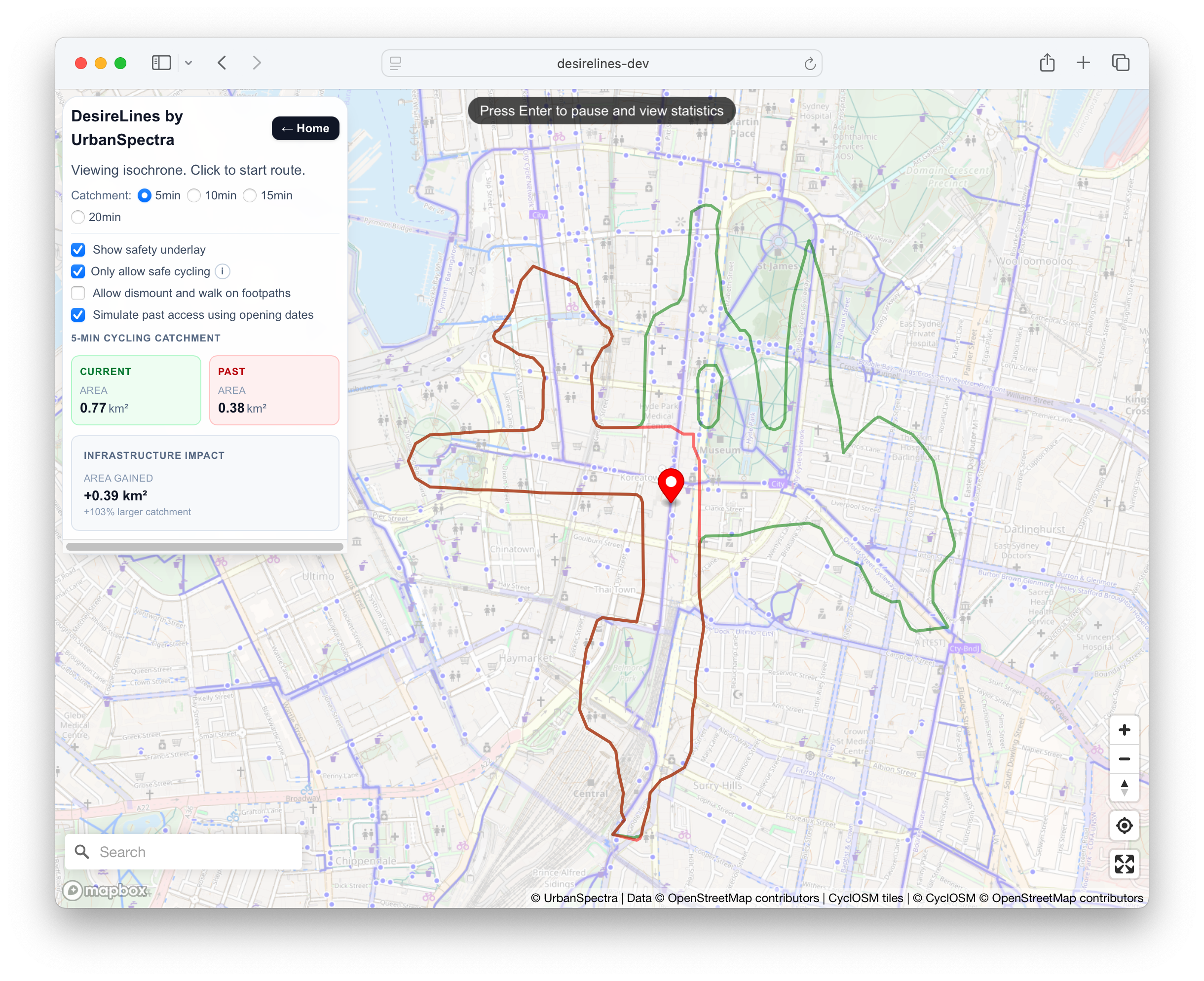
This tool, or similar analysis, could be utilised to visualise the impact of future cycleway proposals, along with the impact of traffic signals (and their programming changes) on temporal road space allocation.
7 Conclusion
See headline findings under the Executive Summary
This analysis estimates approximately 48,000 cycling trips (including pro-rated trips) occur in the City of Sydney council area on a typical weekday in March 2026, derived from approximately 264,000 daily cycle kilometres.
Repeating the method on earlier years’ data finds cycling activity in the LGA has increased over the period where data is available (Section 5.3). As set out in Section 5.4, these figures are broadly consistent with independent benchmarks, including TfNSW Household Travel Survey estimates (Section 5.4.1) and an academic machine-learning estimate (Section 5.4.3).
These results sit within a broader historical and policy context influencing these figures. Reducing “private vehicle kilometres travelled in urban areas” is a NSW Government Priority Measure,[74] and increasing active transport mode share is an objective across multiple levels of government, however less than 1% of the state government transport budget is allocated to active transport[75]. In areas which have received investment, it has been shown there is sufficient space to create a separate system of bicycle paths[76, p. 2].
There is extremely high growth in the usage of share bikes. While sixteen years ago Sydney was characterised as “one of the developed [sic] world’s most hostile cities for cycling” and “the city that hates bikes”[77], of 280 cities[78] Sydney is now the second-highest user of Lime share bikes in the world[75] (after London).
The estimate is an informed approximation rather than a precise count of cycling activity, which cannot be measured directly. It depends on the described assumptions and is subject to limitations (Section 5.2) - including the representativeness of count locations (Section 5.2.1), the conversion of peak-period counts to daily activity (Section 5.2.2), and the selected average trip length.
The figure can support public communication and decision making, and the method can be updated with updated, more accurate (or openly-released) data as it becomes available - to better understand change over time.
Outputs of any traffic estimation (or traffic modelling) must be interpreted with care, understood in the context of limitations, and not over- or under-stated. Significant limitations of this analysis (Section 5.2) include the availability of representative count data in outer areas of the city (Section 5.2.1). The output measures actual trips rather than demand: low volumes do not necessarily indicate an absence of latent demand[79] and high volumes do not necessarily indicate a safe connected network33. A more ambitious and coordinated approach is required to realise the full potential of cycling as a mainstream mode of transport in NSW, including increased funding and stronger alignment between levels of government[82] [83].
8 Appendices
8.1 Licences
| Dataset | Use | Original Author | Publisher | Commissioned/funded By | Licence |
|---|---|---|---|---|---|
| This report PDF | UrbanSpectra (Jake Coppinger) | City of Sydney | City of Sydney | CC BY 4.0 | |
| Trip estimation algorithm implementation | UrbanSpectra (Jake Coppinger) | City of Sydney | City of Sydney | GNU AGPLv3 | |
| ‘new’ automatic cyclist counters34 | Cyclist flows | City of Sydney (MetroCount devices) | City of Sydney | City of Sydney | CC BY 4.0 |
| ‘old’ automatic cyclist counters | Cyclist flows | City of Sydney (Eco-Counter) | City of Sydney | City of Sydney | CC BY 4.0 |
| half-yearly manual traffic counts35 | Cyclist flows | Matrix Traffic and Transport Data | City of Sydney | City of Sydney | CC BY 4.0 |
| Street lines and maps | Calculating network lengths; maps | © OpenStreetMap contributors36 | City of Sydney | ODbL | |
| ‘See.Sense’ statistics37 38 | Estimating average trip lengths | See.Sense (Limeforge Ltd) | City of Sydney | City of Sydney | CC BY 4.0 |
| State roads | Calculating network lengths | TfNSW, NSW Government (39) | TfNSW | CC-BY-4.0 | |
| TfNSW Household Travel Survey data | Estimating average trip lengths; number of trips | © State of New South Wales (Transport for NSW)40 | City of Sydney | CC BY 4.0 | |
| TfNSW cycling count data | Cyclist flows | Transport for NSW | Transport for NSW | CC BY 4.041 | |
| DuckDB database (SQL views) | UrbanSpectra (Jake Coppinger) | City of Sydney | City of Sydney | GNU AGPLv3 | |
| DuckDB database (derived data) | UrbanSpectra (Jake Coppinger), derived from original dataset | City of Sydney | City of Sydney | CC BY 4.0 |
UrbanSpectra (Jake Coppinger) is the author of this report and The Council of the City of Sydney is the publisher. City of Sydney staff Sarah Brickhill (Manager, Transport Planning) managed this project, and Fiona Campbell (Manager, Cycling Strategy) provided regular input.
This report, cycling count data and the algorithm to estimate trips are published by the City of Sydney under open source licences.
This methodology was significantly inspired by the TfL Cycling Use Estimates Method[2], documented in extremely clear and accessible writing. Special thanks to Gonzalo de Ana Rodríguez (Principal Analyst at TfL), its main author, for providing clarifications and additional technical guidance.
Any further modifications to AGPLv3 materials must be released openly and credited appropriately. Any usage of CC BY 4.0 materials must give appropriate credit.
BOM weather data is included with the codebase.
Data utilised in charts is cited; attributions should be retained if charts are republished. Chart data attributions like A/B mean A is the publisher, and B was the original authoring company.
8.1.1 Attribution
This report may be cited as:
Coppinger, J (2026). Quantifying Cycling Trips in the City of Sydney. UrbanSpectra Pty Ltd. The Council of the City of Sydney.
Bibtex:
@techreport{coppinger2026,
title="Quantifying Cycling Trips in the City of Sydney",
publisher="City of Sydney",
author="Jake Coppinger",
institution="UrbanSpectra Pty Ltd",
location="Sydney, Australia",
year=2026
url="https://urbanspectra.com/report/2026/07/quantifying-cycling-trips-city-of-sydney/"
}
MediaWiki CS1 (Wikipedia)
<ref>{{cite report
|title=Quantifying Cycling Trips in the City of Sydney
|publisher=City of Sydney
|author=Jake Coppinger
|others=UrbanSpectra Pty Ltd
|location=Sydney, Australia
|date=July 2026
|url=https://urbanspectra.com/report/2026/07/quantifying-cycling-trips-city-of-sydney/
}}</ref>
8.2 Tabular Data
Detailed tabular data can be viewed by inspecting the included DuckDB database.
8.3 Data quality notes
8.3.1 Turn description assumptions
See Section 4.2.1.2 for discussion of large swings in counts at some locations
Turn description mapping necessarily involves some assumptions. Mapping them was a manual process, and additional locations change over time, in a way that can be challenging to record. There may be errors or mistakes in the mapping.
General heuristics:
- If a footpath crossing is a shared path, it shouldn’t be assigned to the parallel road
- Where a cycleway is captured by a footpath (extremely high volumes) - that footpath crossing should not be added to the adjacent road
- The most recent infrastructure type is specified when the author is aware it has been changed, unless mapping an older location (no longer measured in recent surveys) where the author is certain of the condition at the time (eg. George St at site 7 was not surveyed as a quiet street/shared zone)
Notes for each site number:
- For 9 (Kent & Clarence), movements 9 and 10 appear to be from the bridge to Kent St (north). Such movements almost certainly use the cycleway. A separate loop is made for this.
- It is assumed Clarence St here represents the street and not the underpass, given the 0 movements on turn 11.
- For 11, the north footpath and the east footpath appear to be the separated cycleways. This has valid data in the (human readable) overview sheet but the later (denormalised machine-readable) sheets are blank/invalid. It has blank sheets for 2018-10 to 2023-03, data in 2023-10, missing data in 2024-*.
- For 12 (College & Oxford), the northern footpath appears to be mapped as the cycleway. Additionally
Oxford St WB RTappears to be on road, but one cycleway to another. - For 14, the north footpath appears to be the cycleway. The south (east-west) footpath is assigned to Liverpool St. The north footpath is therefore excluded for Liverpool St road counts eastbound and westbound.
- For 15, no loop is added for eastern leg - this is effectively a driveway.
- For 18, the bridge is not added due to unsupported additional sheet format
- For 21, the spreadsheet file is missing in 2025-03. This is the harbour bridge offramp, so this is a significant missing flow.
- For 22, West crossing is not included for Cumberland St - appears to be in series with underpass and not to Cumberland St.
- For 24, Burrows Rd South of Canal Rd is not added, as it turns into limited access. It’s also outside the LGA.
- For 26 Bourke / Gardeners - the north crossing is assigned to the shared path, the west to the cycleway, and the east to the road.
- North crossing doesn’t have a bicycle lantern - however perhaps acts as the terminus of the Gardeners Rd shared path
- For 37 - assuming on Bayswater Rd and Neild Av due to geometry and wider map (even though it states New South Head road)
- For 39, there is some strange recording with some sheets being named Burton St and some named Bourke St (at Victoria St). Given there is no intersection of any Victoria St with Bourke St, and the numbers align with the one-way patterns at this intersection, these are assumed to all be typos of Burton St
- For 45 - Railway Pde doesn’t differentiate between road, shared path or cycleway.
- Note the northern virtual screenline (railway-pde-north-of-swanson-st) is tagged as a shared path, but eventually turns into a cycleway.
- The Burren St loop is quite far away from the crossing, so the footpaths are not included on it.
- For 48 (
mitchell-rd-south-of-huntley-st), off-road turn movements are assigned to the cycleway. - For 58, a parallel footpath movement is excluded (the north-western pedestrian movement) from the
johnston-st-south-west-of-the-crescentandchapman-rd-east-of-the-crescentvirtual screenlines as it connects to the shared path on the west side of The Crescent, and there is no shared path south-west along Johnston Street - and these trips likely came from the Jubilee Pk Shared path rather than Chapman Rd. It therefore does not make sense to assign The Crescent North Crossing footpath trips to Johnston Street.- This footpath movement is assigned to
the-crescent-shared-path-crossing-at-johnston-st
- This footpath movement is assigned to
- Site 60 (Darlinghurst Rd Exit, Darling Hurst Rd, Kings Cross Rd, Victoria Rd, Darling Hurst Rd) was discarded - it is extremely unclear how the turn movements map. One of the most significant movements is turn 11 Kings Cross Rd SRT - Kings Cross Road to Darlinghurst Rd Exit. If this refers to Kings Cross Road to a primary link ramp from Darlinghurst Rd to William St - that is cyclists opposing a one way street, using Victoria St, crossing over and taking high speed road ramp. Perhaps the road configuration has changed in the time since this older site.
- For 66 - only the west crossing (16) is included in Anzac Pde. East crossing is assigned to the eastern shared path
- Site 68: As Bedford st and Australia St have a small plaza then two exits, this flow can’t be attributed to either of their two exits. They are therefore left out.
- For 70 - for the east-side loops, the south east-west-footpath crossing is assigned to the cycleway: the south footpath crossing appears to be the bike lane. The north is assigned to the road.
- For 71:
- The south footpath has a high volume and appears to denote the cycleway crossing. This is technically a cycleway, so this has been applied to the Wilson St eastbound cycleway. It is unclear whether turn movement 11 (Wilson St EB T) includes cyclists who use the road, then use the short cycleway crossing, then head along the wilson st cycleway eastbound - if not, then this loop volume is an underestimate. It might also be reasonable to apply half this metric to the wilson st eastbound road volume (one-way road) and half to the one-way contraflow cycleway.
- All northbound volume on Burren St is assigned to the road, all southbound volume is assigned to the footpath - ie. it is assumed all southbound cyclists use the separated cycleway provided (which also matches the author’s personal experience at this intersection)
- All movements on Wilson St east of Burren St are assigned to the cycleway - as this is parallel two-way cycleway following this road, and there is no additional data sheet delineating cycleway versus road movements.
- For 72:
- for the
oxford-st-north-west-of-flinders-stscreenline:- movements are not included that could be interpreted, or likely, to use the Oxford St cycleway - as this is a on-road/state-road virtual screenline
- Eg. the Bourke St(Nth) Crossing is not included - such trips likely use the cycleway to the north-west of the count location
- Bourke St(Sth) LT is included, as we assume if they used the cycleway - they would be counted in the Oxford St(West) Crossing footpath count (and then use the on ramp to the cycleway)
- there is not enough information provided in this manual count to accurately quantify cycleway trips
- Careful interpretation will be needed when the cycleway is extended
- One must assume Oxford St East cycleway trips from the Bourke St cycleway (north of Oxford St) are not counted as turn movement 12 (Bourke St(Nth) RT) (or vice-versa under 13), as there were only 23 (39) movements during the 2026 peak. This is assumed to be Bourke St (north of oxford) to Oxford St on road, private vehicle lane flows.
- movements are not included that could be interpreted, or likely, to use the Oxford St cycleway - as this is a on-road/state-road virtual screenline
- the Bourke St North Loop could reasonably be defined as a variety of different street types:
- a local road because this is a road movements table or Forbes St is a local road (or quietway given the immediate modal filter), a shared path as the current terminus of the Oxford St cycleway, or a cycleway as the northern Bourke St cycleway.
- The type is chosen to be a cycleway as representing Bourke St (of which the cycleway was one of the first in Sydney and is a major route, and it is expected most trips continue to the Bourke St cycleway), and due to the current termination of the Oxford St east cycleway terminating into this shared zone, perhaps also represents Oxford St cycleway flows
- That is - for one to continue from the Bourke St cycleway via Taylor Square (or vice versa), one must use the northern footpath (shared path crossing) during the effective (though not legal) scramble pedestrian phase, then use the northern shared zone to continue north-west on oxford street or north along the bourke st cycleway
- Future data analysis could evaluate the split to oxford st east vs bourke st vs forbes st (or even vs the not-signposted but legal in a strict sense shared path on the north side of oxford street towards darlinghurst road)
- for the
- For 74:
- At the intersection of Carrington Dr and Parkes Dr, there is a large volume from Carrington Dr to Parkes Dr: Carrington Dr Leg 8 to Leg 7, Parkes Dr Leg 7 to Leg 8. Note the significant direction asymmetry in these flows; the larger Carrington Dr to Parkes Dr figure also matches with Grand Drive being one-way eastbound and Loch Av being one-way northbound to Robinson Dr. Recreational activity is still trips, however with the limited number and representation of counters (and such trips being fully outside the City of Sydney boundary), these are not included to prevent any possibility of looping recreational flows inflating trip metrics outside this recreational area.
- For 76:
- No loops are added for Miller St or Saunders St cycleway, as they can’t distinguish from cycleway/road values. This is the only/most direct route to/from the Anzac Bridge and Pyrmont Bridge
- For 78:
- For
NEW Oct2018_78. Pyrmont Bridge Rd...xlsx, the bicycle extra count sheets have a typo ("Prymont Bridge (West Bound)"). This is handled by including both thePrymontandPyrmontspellings in the turn-description mapping (both assigned to thepyrmont-bridge-extra-countloop), so no extra-count data is dropped. - See excluded file as well
- There is no cycleway component stated for the west side of the intersection. Movements 17 and 18 (
78_17/Pyrmont Bridge Rd LT,78_18/Pyrmont Bridge Rd SLT) are assumed to be cycleway movements (note 18 is the large movement, as expected). The turns directly left from the cycleway and right from Murry St are assumed to be into the cycleway- Movements
78_19/Pyrmont Bridge Rd SRT,78_20/Pyrmont Bridge Rd RTare excluded as it is unclear if they would have originated from the cycleway or on road counts.
- Movements
- There appears to be an error in 2010-03:
Pyrmont Bridge Rd SRT(turn id 19) is the highest flow, yet leads toDarling Drrather thanPyrmont Bridge
- For
- For 80:
crystal-st-south-of-crescent-stis a shared zone/quietway, but connects to a cycleway. These counts are assigned as a cycleway category- For the
phillip-st-west-of-bourke-stcounter, as the south (Bourke St Crossing) and north footpath crossings are shared crossings, yet there is no shared path along Philip Street, it is highly likely these footpath flows are transitioning from Crystal St to the Bourke St cycleway southbound or northbound. For this reason - along with this virtual screenline count being an outlier when plotting Footpath vs road bicycles per virtual loop per day (730 footpath flows to 233 road flows), it is removed from this loop
- For 85, the north crossing is assigned to a shared path rather than the state road
- For 87,
fitzroy-st-west-of-crown-stis a short section of shared zone, but could also reasonably be tagged as a road. - For 88, it is clear movements 16 and 17 are the cycleway from Eddy Av to/from Chalmers Street. Other movements into Eddy Av are uncertain - these could be navigating onto the cycleway, or using the road.
- For the
elizabeth-st-north-of-foveaux-stloop, the pedestrian crossing over Foveaux St is excluded, as a significant number (if not most) of cyclists using this crossing are using it as the only feasible route from the Chalmers Street/Eddy Av cycleway to the Fitzroy Street cycle route (which, while it doesn’t have much dedicated infrastructure, is a well known signposted route east-west across Surry Hills): https://www.openstreetmap.org/relation/2319564
- For the
- For 94:
- We assume all Kelly St movements use the cycleway (since the cycleway was built), in the absence of any cycleway vs road data.
- We assume all Wattle St to Kelly St movements use the cycleway (since the cycleway was built)
- We assume all southbound movements through (Wattle St SB T) and right turning (Wattle St SB RT) movements use the shared path, and assign them to a separate shared path loop - as Wattle St is one way northbound
- We assign North/South footpath crossing movements (Kelly St West Crossing) to this shared path rather than to Wattle St (on road) movements - it is considered unlikely a cyclist would use the footpath crossing, and then transition to use a busy state road when a shared path is available.
- As Wattle St northbound movements are significantly larger than the southbound shared path movements (82 vs 25+12), we do not include any northbound movements on this virtual shared path loop. This results in an underestimate for the shared path
- We assume left turning movements from Kelly St to Wattle St use the cycleway on Kelly St, then the road on Wattle St - as these are recorded as on road movements.
- We create a state road virtual screenline for the northbound Wattle St volume. This could be an overestimate if these movements actually used the shared path - but the spreadsheet states they are recorded as on-road movements.
- For 97: west street excluded as a driveway
- For 99
link-rd-north-of-epsom-rddoes not count footpath movements as using the road, because it’s a roundabout. - For 100: Strangely, there appears to be one southbound movement on South Dowling St, a one-way state road offramp.
- For 103: Epsom Rd East Crossing not included for crossings on north and south, as it leads to a shared path (which isn’t measured)
- For 108:
- it should be noted the cycleway here is a one-way (uphill) cycleway, and the downhill cycle movements must use the road
- it is assumed turn movements from riley st to campbell st eastbound turn onto the cycleway
- the eastbound on-road vs cycleway split - assuming the northern footpath crossing is representing the cycleway - is 18/170 (~10%) in 2026
Possible improvements for future manual counts: - Site 72 (Oxford St at Flinders) is a critical intersection, however there is no visibility into cyclists using the Oxford Street cycleway - and interpretation risk in these flows being assigned to bourke-st-north-of-oxford-st or to the on road flow oxford-st-north-west-of-flinders-st - Ideally, future manual counts here would differentiate between flows to/from Oxford St north-west(on-road), to the cycleway (which must take place through the pedestrianised space currently), to the Bourke St cycleway northbound, to Bourke St (on road), to Forbes Street (on road), or to the footpath on the north side of Oxford St (east of the intersection / outside the Darlinghurst Law Courts) - Site 74 (Moore Park Rd at Oxford St) already has this level of detail for example - There are few counts on quietways/bicycle streets, and no automatic counts.
Note - there are some apparent typos in some mapping strings. These may result in undercounts / underestimates.
- Spelling
Swanston St {Crossing, LT, RT, SLT, SRT}should beSwanson St ...(extra “t”): these five variants appear in 2018-10 only. (The same misspelling also recurs asSwanston St {EB/WB ...}in 2010-03 → 2014-03, but those fuzzy-match against Watson/Wilson rather thanSwanson St.)Towards City( East to North)/Towards City( West to North)— missing space afterCity(; recorded form isTowards City (East to North). TheEastvariant appears in 2022-03; theWestvariant in 2019-03, 2019-10, 2020-03, 2020-10, 2021-10, 2022-10.Johnston St NB {LT, RT, T}vs recordedJohnson St ...: 2017-10 only.
- Abbreviation:
Av/Ave— O’Dea Av: every survey 2010-03 → 2016-10 (14).Avenue/Ave— Dunning Avenue (2010-03, 2010-10, 2011-10, 2012-03, 2013-10, 2014-03, 2014-10, 2015-03, 2015-10, 2016-03, 2016-10); Greenknowe Avenue (2010-03 → 2016-10, 14); Neild Avenue (2010-03 → 2017-03, 15).Drive/Dr— Darling Drive (2010-03 → 2014-10, 10); Johns Hopkins Drive (2010-03 → 2016-10, 14).Parade/Pde— Anzac Parade (2010-03 → 2017-10, 16); Railway Parade (2018-10 only).Street/St— Wilson Street (2011-10, 2012-03, 2013-03, 2013-10, 2014-03, 2014-10, 2015-03, 2015-10, 2016-03, 2016-10).Darling Hurst Rd/Darlinghurst Rd(2010-10, 2012-03, 2012-10, 2013-03, 2013-10, 2014-10, 2015-03, 2015-10, 2016-03, 2016-10, 2017-03, 2017-10).O'Dea St/O'Dea Ave(2010-03 → 2017-10, 16).
Note there appear to be examples in site 23, 48, 72 and 74 where the turn id for a given description has changed over time. Eg. for site 74, counts before ~Mar 2025 use 74_13, later use 74_11.
The City of Sydney operates a network of 26 ‘new’ counters which have been reliable so far (however CoS20 appears to have missing data between ~2026-01-29 and 2026-02-17). The previous counters had lots of missing data for durations.
8.3.2 Manual count files with anomalies
See SKIPPED_MANUAL_COUNT_FILENAME_SUBSETS in the codebase. These represent a very small number of the many manual data files.
[1]
David Green; Kenneth Lewis; Ann-Marie Head; Jeanette Ward; Cameron Munro (April 2020) [August 2009]. Guide to Traffic Management Part 3: Transport Study and Analysis Methods (registration required) (PDF). austroads.gov.au (Report). Edition 4.0. Austroads. ISBN 9781925854770. AGTM03-20. Note: This is not the 2017 copy that often appears in search results.
[2]
Transport for London (2025-05-17). "Cycling use estimates: methodology note" (PDF). Transport for London. Archived (PDF) from the original on 2026-03-18.
[3]
Navreet Virdi (October 2025). Transport Modelling Guidelines. standards.transport.nsw.gov.au (Technical report). Transport for NSW. TS 05461.
[4]
William G. Cochran (1977). Sampling Techniques (3rd ed.). John Wiley and Sons. ISBN 0-471-16240-X.
[5]
Correspondence, Meead Saberi
[6]
Meead Saberi; Tanapon Lilasathapornkit (2024). "Scalability challenges of machine learning models for estimating walking and cycling volumes in large networks" (PDF). npj Sustainable Mobility and Transport. doi:10.1038/s44333-024-00009-1. Archived (PDF) from the original on 2025-03-22.
[7]
Sinclair Knight Merz (August 2012). Sydney Cycling Survey 2011 - Methods and Findings (PDF) (Report). RMS & NSW Bureau of Transport Statistics. ISBN 9780731328529.
[8]
Kent, Jennifer; Crane, Melanie; Mottee, Lara; Bordley, Charlene; Kollaras, Lisa; Peel, Nicole; Campbell, Fiona (2026-06-29). The Transformers Project: Evaluation, Findings, Implications (PDF) (Report). Sydney: University of Sydney. doi:10.25910/c3qw-m916.
[9]
"Travel in London reports". Transport for London.
[10]
"cycling.data.tfl.gov.uk (/ActiveTravelCountsProgramme/ Folder)". Transport for London.
[11]
"TfL's Cycle Counts Dashboard". Transport for London.
[12]
"User guide for TfL's Cycle Counts Dashboard" (PDF). cycling.data.tfl.gov.uk. Transport for London. Archived (PDF) from the original on 2026-06-07.
[13]
Transport for London (2022). Travel in London report 15 (PDF) (Report). Transport for London.
[14]
Cycling action plan 2 - Building on successes (PDF) (Report). Transport for London. June 2023. Archived (PDF) from the original on 2026-07-08.
[15]
"Travel in London 2024 Active travel trends" (PDF). Transport for London. March 2025. Archived (PDF) from the original on 2026-02-26.
[16]
Nordback, Krista; Sellinger, Michael; Phillips, Taylor (2017). Estimating Walking and Bicycling at the State Level (Report). Portland, OR: Transportation Research and Education Center (TREC). doi:10.15760/trec.163.
[17]
Krista Nordback, Michael Sellinger (May 2014). Methods for Estimating Bicycling and Walking in Washington State (Report).
[18]
Hao Wu; Jinwoo (Brian) Lee; Christopher Pettit (2024). "What affects commute cycling in Sydney: Access, infrastructure and demographics". Transportation Research Interdisciplinary Perspectives. 24: 101076. doi:10.1016/j.trip.2024.101076.
[19]
"Bike Data Is Important But How Is It Measured". Bicycle NSW. 2021-06-04. Archived from the original on 2024-03-19.
[21]
"Mapping Bicycling Ridership Across the Sydney Metropolitan Area with Strava Data". Strava. Archived from the original on 2025-08-05.
[22]
[23]
Raoul Casagrande (2015-10-23). "Untitled letter". VicRoads.
[24]
Jing Bie (2014-03-31). "Evaluation Bicycle Counts". Grontmij. De Bilt. 327011.
[25]
Cameron Munro (2011-07-06). "Validation of MC5720 on Albert St, East Melbourne". SKM.
[26]
"Walking and cycling counts". Transport for NSW.
[27]
Correspondence, 2026-04-17
[28]
Correspondence, 2026-05-26
[29]
Correspondence, 2026-05-29
[30]
"Cycling Count". Transport for NSW Open Data. Transport for NSW. 2025-03-05.
[31]
City of Sydney. "Bicycle count - City of Sydney". Transport for NSW Open Data.
[32]
City of Sydney. "Bicycle count explorer (Cyclists in the City - Site counts for a day in...)". ArcGIS Experience.
[33]
Farhana Ahmed; Geoff Rose; Christian Jacob (2010). Impact of weather on commuter cyclist behaviour and implications for climate change adaptation (PDF). Australasian Transport Research Forum. Canberra. Archived (PDF) from the original on 2023-03-07.
[34]
Sandar Tin Tin; Alistair Woodward; Elizabeth Robinson; Shanthi Ameratunga (2012). "Temporal, seasonal and weather effects on cycle volume: an ecological study". Environmental Health. 11 12. Auckland. doi:10.1186/1476-069X-11-12.
[35]
"Notes to accompany Daily Weather Observations". Bureau of Meteorology.
[36]
Jan Wessel (2020). "Using weather forecasts to forecast whether bikes are used". Transportation Research Part A: Policy and Practice. 138: 537–559. doi:10.1016/j.tra.2020.06.006. ISSN 0965-8564.
[37]
Gary Davis; Trina Wicklatz (October 2001). Sample-Based Estimation of Bicycle Miles of Travel (BMT) (PDF) (Report). Department of Civil Engineering, University of Minnesota: Minnesota Department of Transportation. MN/RC - 2001-23.
[38]
Nordback, Krista; Kothuri, Sirisha; Johnstone, Dylan; Lindsey, Greg; Ryan, Sherry; Raw, Jeremy (2019). "Minimizing Annual Average Daily Nonmotorized Traffic Estimation Errors: How Many Counters Are Needed per Factor Group?". Transportation Research Record: Journal of the Transportation Research Board. 2673: 036119811984869. doi:10.1177/0361198119848699.
[39]
Brum-Bastos, Vanessa; Ferster, Colin J.; Nelson, Trisalyn; Winters, Meghan (2019-11-27). "Where to Put Bike Counters? Stratifying Bicycling Patterns in the City Using Crowdsourced Data". Findings. doi:10.32866/10828.
[40]
"Traffic Volume Viewer". Transport for NSW.
[41]
"Network Operations – Schedule of Fees" (PDF). Transport for NSW. n.d. Archived (PDF) from the original on 2026-06-28.
Note: Includes "PLEASE NOTE: The above services are supplied at the discretion of the TfNSW Director Network Operations."
Note: Includes "PLEASE NOTE: The above services are supplied at the discretion of the TfNSW Director Network Operations."
[42]
Aston Brown (2026-07-05). "Reducing speed limits in cities can save lives. Why is Australia still reluctant?". The Guardian. Archived from the original on 2026-07-05.
[43]
Vanessa Wright (July 2024). Active Transport Survey 2024 Report (PDF) (Report). Taverner Research Group. City of Sydney. Archived (PDF) from the original on 2025-04-18.
[44]
Cycleway Design Toolbox (PDF) (Report). Transport for NSW. December 2020. pp. 14, 15, 40. Archived (PDF) from the original on 2025-12-09.
[45]
"TfNSW Bicycle Network Data Dictionary" (PDF). 1. Transport for NSW. 2021-08-01. Archived (PDF) from the original on 2026-06-10.
[46]
Jake Coppinger (2023-08-02). "Contraflow streets in the City of Sydney". jakecoppinger.com.
[47]
"Building the Primrose Quietway in Rosebery". City of Sydney.
[48]
Oxford Street East Cycleway Consultation Report (PDF) (Report). Transport for NSW. December 2023. Archived (PDF) from the original on 2026-03-20.
[49]
Oxford Street Revitalisation Project - A new vision for Oxford Street (PDF) (Report). Transport for NSW. November 2025.
[50]
Correspondence, 2026-04-17
[51]
Bicycle Network (March 2024). Sydney Rider Demographic Surveys (Report).
[52]
Micromex Research (May 2025). 2025 Rider Demographic Surveys City of Sydney (Report).
[53]
Micromex Research (April 2026). 2026 Rider Demographic Surveys City of Sydney (Report).
[54]
Excel data - CoS Rider Demos 26 25 24 - 2026-05-14.XLSX. City of Sydney. 2026.
[55]
Correspondence, TfL officers
[56]
"Rider Log GPS". Data.NSW.
[57]
"RiderLog Anonymised Bicycle Trips, Greater Sydney NSW 2010-2013". UNSW City Futures Research Centre. 2024-09-12.
[58]
Leao, Simone Z.; Lieske, Scott N.; Conrow, Lindsey; Doig, Jonathan; Mann, Vandana; Pettit, Chris J. (2017). "Building a National-Longitudinal Geospatial Bicycling Data Collection from Crowdsourcing". Urban Science. 1. doi:10.3390/urbansci1030023.
[59]
Pettit, Christopher; Lieske, Scott; Leao, Simone (2016). BIG CYCLING DATA PROCESSING: FROM PERSONAL DATA TO URBAN APPLICATIONS. IPSRS Conference, International Society for Photogrammetry and Remote Sensing. Prague, Czech Republic.
[60]
"AI-powered data dashboard for cycling safety and planning". iMove. 2025-09-25. Archived from the original on 2026-04-19.
[62]
Adithya Dattatreya (2025-09-06). "See.Sense secures grant to power Australia's cycling infrastructure with AI". Zag Daily. Archived from the original on 2025-10-06.
[63]
See.Sense (Limeforge Ltd) (2026-06-11). City_of_Sydney_cycling_trips_2026-03-05_to_2026-06-11.xlsx.
[64]
Correspondence, 2026-05-26
[65]
AMR (July 2013). Sydney Cycling Survey 2012 - Methods and Findings (PDF) (Report). 1.1. ISBN 978-0-7313-2865-9.
[66]
"Household Travel Survey (HTS)". Transport for NSW.
[67]
"Household Travel Survey 2020/21 to 2024/25 Data Document" (PDF). Transport for NSW. 2026. Archived (PDF) from the original on 2026-07-11.
[68]
Correspondence, 2026-05-15
[69]
Correspondence, 2026-05-27
[72]
"City of Sydney Method of travel to work". .id. 2021.
[74]
Connecting NSW Strategy Priorities for Transport (PDF) (Report). Transport for NSW. October 2025. ISBN 978-1-923242-23-4. Archived (PDF) from the original on 2026-02-27.
[75]
Aston Brown (2026-03-19). "Sydney's inner west has the conditions for a cycling boom, but riders say the network falls short".
[76]
Kinhill Pty Ltd; Sinclair Knight & Partners Pty Ltd (October 1982). Inner Sydney Bikeplan - Regional Plan (Report). S82008/M82009.
[77]
Matthew Moore (2010-03-13). "Sydney: the city that hates bikes". Sydney Morning Herald. Archived from the original on 2026-02-28.
[78]
William Peters (2024-08-18). "Response of Lime Network Pty Ltd (Lime) to NSW Legislative Council Portfolio Committee No. 6 Inquiry into the use of e-scooters, e-bikes and related mobility options" (PDF). Parliament of NSW. p. 4 (PDF 5). Archived (PDF) from the original on 2025-08-14.
[79]
Ryan Martinson (Summer 2018). "Equity & Mobility (Transportation Talk Magaine)" (PDF). Canada: Canadian Institute of Transportation Engineers. p. 28. Archived from the original (PDF) on 2026-06-10. Additional archives: 2018-07-18. Issue 2, vol 40.
[80]
Showcasing safe Movement & Place (PDF) (Report). transport Australia. February 2026. p. 11. Archived (PDF) from the original on 2026-07-14.
[81]
Meredith Glaser; Kevin J. Krizek (2021). "Can street-focused emergency response measures trigger a transition to new transport systems? Exploring evidence and lessons from 55 US cities". Transport Policy. 103: 146–155. doi:10.1016/j.tranpol.2021.01.015.
[82]
Mike S. Harris; Lee Roberts (2026-03-26). "Bicycle infrastructure for the 'Interested but concerned': a literature review of global trends and local insights from Sydney's cycling network". Australian Planner. doi:10.1080/07293682.2026.2654457.
[83]
Sela Musa (2024-12-13). "How Sydney has rebranded itself from the "city that hates bikes"". Archived from the original on 2025-11-22.
For March 2026, 328 virtual screenlines around 78 manual count sites. See Section 4.1.1.2.3 for details on counter location changes.↩︎
Assuming an average trip length of 5.5 kilometres (Section 5.1.3.8), and assigning parallel footpath movements to a given road segment (where cycling on the road is not desired, or is dangerous). Manual counts are on a fair-weather weekday, most often a Tuesday, but a significant number on other weekdays. Automatic count data is aggregated to a weekday average of the given count month, which is likely a conservative underestimate of the ‘fair-weather’ count volume.↩︎
Note the assumptions and limitations on past estimates discussed in the Section 5.2 section.↩︎
Confidence intervals have not been included in other estimates by TfNSW, in papers describing these TfNSW estimates[6], or in TfL public reporting.↩︎
However Austroads guidance for estimating Vehicle Kilometres Travelled (VKT)[1, p. 121] (PDF 132) is broadly similar to this study’s methodology. See detail under Section 5.1.↩︎
The Atlyst dashboard includes filter options for bicycles. The default options include
Bicycle,Bicycles - short,Bicycles - medium,Bicycles - longas checked andUnclassifiable,PedestriansandRejectedunchecked. There were some flows shown whenUnclassifiable,RejectedorPedestrianwere selected - for examplecos13on 2026-03-17 has 36UnclassifiableorRejecteddetections (compared to 1914 for the default selected filters). No documentation is provided for how these categories are determined: in the absence of ground truthing of the current installation and ascos13had slightly higher flows than the nearby manual count on this day (see Section 4.2.3), the default options were not changed for data export. These Atlyst-validated values are assumed as accurate, and at worst an undercount.↩︎I encourage any OSM contributors to survey TfNSW automatic counter locations on the ground for improved future data availability.↩︎
‘Total spotted’ values and count locations are published on the City Open Data site.↩︎
As you can imagine, this took quite some time.↩︎
The assumptions relate to the mappings in
virtual-loop-definitions/virtual-loops.json↩︎Note the nuance in the meaning of a turn movement type (
'footpath' | 'road' | 'off-road, where ‘off-road’ is from theAdditional Information.xlsxcount sheet) compared to a loop type (the infrastructure it represents). For more detail, see comments in SQL schema for tableturn_descriptions_to_virtual_loops.↩︎The Atlyst dashboard includes filter options for bicycles. The default options include
Bicycle,Bicycles - short,Bicycles - medium,Bicycles - longas checked andUnclassifiable,PedestriansandRejectedunchecked. There were some flows shown whenUnclassifiable,RejectedorPedestrianwere selected - for examplecos13on 2026-03-17 has 36UnclassifiableorRejecteddetections (compared to 1914 for the default selected filters). No documentation is provided for how these categories are determined: in the absence of ground truthing of the current installation and ascos13had slightly higher flows than the nearby manual count on this day (see Section 4.2.3), the default options were not changed for data export. These Atlyst-validated values are assumed as accurate, and at worst an undercount.↩︎Using the author’s Overpass API instance, to minimise public OSM infrastructure load during development and testing.↩︎
For March 2026, 328 virtual screenlines around 78 manual count sites. See Section 4.1.1.2.3 for details on counter location changes.↩︎
For those more familiar with the built environment: if writing software is like “building castles in the air”, these tools are the total stations and plumb lines.↩︎
Determining entries for bicyclists to all segments, necessary to define link lengths, is challenging due to the bicycle’s manoeuvrability [37, p. 9] (PDF 17).↩︎
The NSW Road Network Categorisation is CC BY 4.0, and TfNSW publishes a waiver for OSM contributions.↩︎
Except at 3 locations in the City, two of which are on roads where cycling is banned[40]↩︎
The Transport for NSW ‘Cycleway Finder’ map and Infrastructure Cycleway Data dataset includes a
Quietwayroad designation, however currently the Cycleway Finder appears to have subtly different data to the linked shapefile. Eg: the Wells St (Redfern) lanes (eg.featureid=879204) are tagged as Quiet Streets in the former, but haveinfra=Roadandfacility=Contra-flow Permittedin the latter. Roads withContra-flow Permitted[45] could be suitable, however there is a significant City of Sydney contra-flow roll-out under way (which the author has been surveying in OpenStreetMap for some time[46]), which do not yet appear to be captured in this data.↩︎Quietways in this dataset are defined as “either”: Length < 200m, Speed <= 30 km/h, Traffic < “300 /day”, Is narrow enough to block two-way car traffic flow, Is within a carpark. ([45, p. 17])↩︎
This does not invalidate the importance of work to collate such information. Thank you to all those involved in thanklessly maintaining and publishing open data at all levels of government - it is critically important.↩︎
The NSW Road Network Categorisation is CC BY 4.0, and TfNSW publishes a waiver for OSM contributions.↩︎
Boundary effects are not limited to geospatial calculations. Woollahra Council withdrew previously given support and opposed the Oxford Street East cycleway on 2023-11-27[48, p. 25]. The latest TfNSW plans for the Oxford Street Revitalisation Project include a cycleway on the City of Sydney side of the street[49, p. 4]. Like electricity on a 132 kV power cable (snaking from Ward Park along Campbell St, George St, Hay St, Thomas Rd, and Ultimo Road to the Goods Line), the Belmore Park shared path or mid-block signals - cycleways and cyclists flow along the path of least resistance.↩︎
Sydney Harbour Bridge Cycleway (Upper Upper Fort St, Millers Point), Pyrmont Bridge Road (92 Union Street Pyrmont), Oxford Street (Surry Hills) (35 Oxford Street Surry Hills), Mary-Ann St & Jones St (Ultimo) (2 Mary-Ann Street, Ultimo), Bourke Street (Surry Hills) (713 Bourke Street, Surry Hills), Wilson Street (Newtown) (236 Wilson St, Newtown) and Gadigal Avenue (Waterloo) (18 Gadigal Ave, Waterloo) [53, p. 4] [52, p. 5].↩︎
This is part of a trial of 400 GPS-enabled bike lights across piloted in the City of Sydney and Surf Coast Shire Councils[62].↩︎
Note the 2020/2021 ‘Other’ category is not comparable to previous years as it does not include Light Rail and Ferry trips[67].↩︎
This can be compared to released HTS cycling data estimating 23,000 trips entirely within the City, and an additional 29,000 trips to/from the City. See following charts and tables.↩︎
This is the first time Transport for NSW has released Household Travel Survey data on cycling to the City of Sydney. The stated reason for not releasing previously was that the sample size is too small as cycling is (or was) a minority mode [68]. Any interpretation of this data should keep this in mind - this analysis does not intend to overstate (or understate) its accuracy.↩︎
Note the TfL Method also raised the small sample size of the London Travel Demand Survey (LTDS), with around 8,000 households surveyed generating approximately 16,000 individuals of data.↩︎
Sydney Harbour Bridge Cycleway (Upper Upper Fort St, Millers Point), Pyrmont Bridge Road (92 Union Street Pyrmont), Oxford Street (Surry Hills) (35 Oxford Street Surry Hills), Mary-Ann St & Jones St (Ultimo) (2 Mary-Ann Street, Ultimo), Bourke Street (Surry Hills) (713 Bourke Street, Surry Hills), Wilson Street (Newtown) (236 Wilson St, Newtown) and Gadigal Avenue (Waterloo) (18 Gadigal Ave, Waterloo) [53, p. 4] [52, p. 5].↩︎
See the
CoSToOSMMappinginterface anddecorateOsmGeoJSONWithCosDatesfunction for more detail.↩︎If it were deemed suitable, retrieving historical OSM data can be a challenge. While the Overpass API supports querying ‘Museum’ data, self-hosting this for a small extract takes some work.↩︎
Significant on-road cyclist volumes are recorded at Regent and Cleveland Streets - 50km/h 5-6 lane arterial roads. These streets have been known as a “difficult location” since at least 1982[76, p. 17], fig. 5; it is incorrect there are no measures that can be implemented[76, p. 26]. In major Australian cities, 40% of all road deaths occur on arterial roads[80] - such high-volume arterial corridors in inner Sydney are often one-way pairs. ‘Emergency Street’[81] interventions are not applied and there is little awareness after a crash occurs.↩︎
The author was provided with a login to download this data from the Metrocount Atlyst dashboard, which provides comprehensive data export capabilities. The City of Sydney is the publisher of this data.↩︎
This analysis would not be possible without the significant amount of manual per-intersection turn movement data recorded since 2010. Thank you to the individual workers who manually reviewed this activity - whether in person or reviewing video from distant countries - in your labour of creating this data.↩︎
The author - Jake Coppinger - is one of thousands of volunteer contributors. The TfNSW Data Services team also contributes to OSM.↩︎
Data from a City of Sydney trial of See.Sense bicycle trackers was utilised to estimate average trip lengths. The only data shared (and published) for this project is the number of daily trips, the km cycled per day, and number of active bicycles. No personally identifiable information (PII) was sighted in this project.↩︎
Cycling trip data provided by See.Sense (Limeforge Ltd) is from the Sydney Rider Insights project. © See.Sense. Daily trip counts and distances derived from on-device GPS, filtered to trips of 0.5–20 km.↩︎
The OSM data was selected by matching it on the NSW State Road network (see Section 5.1.3.6, Section 5.1.3.6.1). This provides indicative routes only and may not reflect the most current version of the Schedule per the Gazettes. The author is aware errors exist in this map - however they are not considered significant for this use case. The charts are Produced Works. The cached OSM geometry in the source code remains under ODbL.↩︎
The City of Sydney is the publisher of this data through this report, including the 28 integers from this spreadsheet required to evaluate the patterns. “The State of New South Wales, acting through the Transport for NSW, supports and encourages the reuse of its publicly funded information and endorses the use of the Australian Governments Open Access and Licensing Framework (AusGOAL)”↩︎
TfNSW granted the City of Sydney a licence to utilise data from the dashboard under CC BY 4.0[28]. The author warmly thanks Karl Muzica and Emily Rucker for their assistance.↩︎